Submitted about 1 year ago
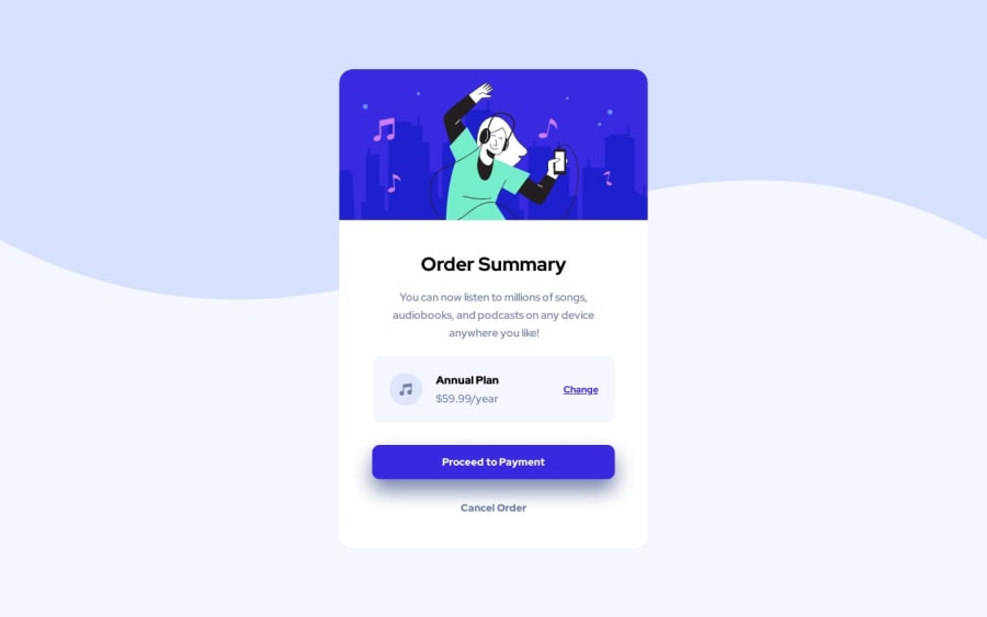
Responsive Order summary component
#accessibility
@D-Salkovic
Design comparison
SolutionDesign
Solution retrospective
Learned how to add backgorund image, and used flexbox to position my elements.
I am unsure if i am using my margins and paddings correctly in @media section to positon my elements to fit the mobile version. I feel like there is a lot of details that im changing, is this common practice?
I am using Figma files as a reference btw :)
Any other tips and suggestions are welcome :)
Community feedback
Please log in to post a comment
Log in with GitHubJoin our Discord community
Join thousands of Frontend Mentor community members taking the challenges, sharing resources, helping each other, and chatting about all things front-end!
Join our Discord
