Not Found
Not Found
Not Found
Not Found
Not Found
Not Found
Not Found
Not Found
Not Found
Not Found
Not Found
Not Found
Not Found
Not Found
Not Found
Not Found
Not Found
Not Found
Not Found
Not Found

Submitted

Responsive order summary component

P

@Abraham-Ogbumah

Desktop design screenshot for the Order summary component coding challenge

This is a solution for...

  • HTML
  • CSS
1newbie
View challenge

Design comparison


SolutionDesign

Solution retrospective


My question is about responsiveness for divs: how do I make the transition to different sizes seamless without the user experiencing the change in size

Community feedback

P
Fluffy Kas 7,735

@FluffyKas

Posted

Hey,

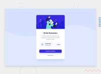
Not sure I understand your question correctly but have you tried using max-width instead of fixed width? That makes things pretty seamless without media queries. Most users don't click on Inspect in their browser though so they don't really experience size changes >.<

I also wouldn't use position: absolute to center a component. Flexbox or grid is easier and fewer lines of code to implement ^^

Your solution otherwise looks pretty good, so well done!

Marked as helpful

1

P

@Abraham-Ogbumah

Posted

@FluffyKas Thank you for your response. I have now used flexbox to center the component and removed the absolute positioning.

Thank you for this

0

Please log in to post a comment

Log in with GitHub
Discord logo

Join our Discord community

Join thousands of Frontend Mentor community members taking the challenges, sharing resources, helping each other, and chatting about all things front-end!

Join our Discord