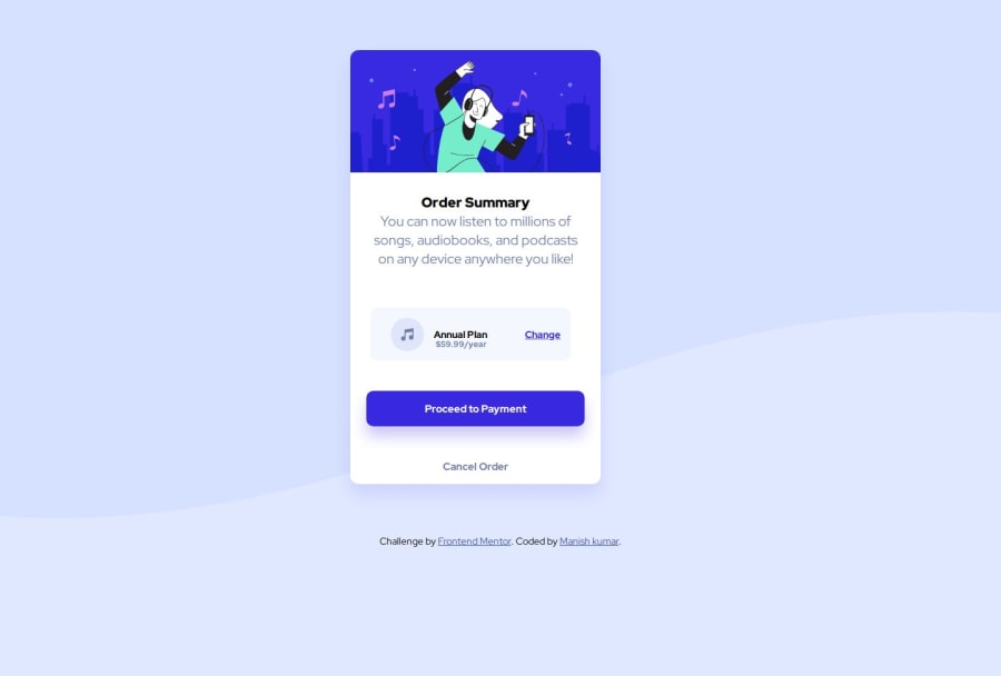
Design comparison
Solution retrospective
I feel proud I am able to make repsonsive webpages and landing pages using html and css and improving old skills and learning something new in every project.
What challenges did you encounter, and how did you overcome them?I face challenge in make responsive this webpage and setting background image.
What specific areas of your project would you like help with?HTML ,CSS and I am able to do make ui designs and landing pages.
Community feedback
- @AdrianoEscarabotePosted about 6 hours ago
Hi manishkumar12i, how are you doing? I really loved the outcome of your project, but I have a few suggestions that I think might be helpful:
To prevent the background image from breaking at higher resolutions, we can prevent this in two different ways:
-
Add a
background-repeat: repeat-x;
, the image will repeat on the horizontal axis, preventing it from breaking. -
Add a
background-size: 100% 50vmin;
, the50vmin
will set its height as the page target, and 100% will make it stretch on the horizontal axis.
Feel free to choose one of the two!
The rest is excellent.
I hope you find it useful. 👍
0 -
- @huyphan2210Posted 1 day ago
Hi, @manishkumar12i
I checked out your solution and I have some thoughts:
- Avoid overusing
div
s. Aim to make your HTML more semantic by using appropriate tags likemain
,footer
,article
, etc. Eliminate unnecessarydiv
s wherever possible. - Establish a clear heading hierarchy. A page should have only one
h1
(Heading 1). I noticed you usedh1
for both "Order Summary" and "Annual Plan." "Order Summary" is the appropriate choice forh1
. For "Annual Plan," ask yourself: Is it a heading? If so, consider usingh2
. If not, choose a more suitable tag. - Simplify your structure. If a parent element has only one child, ask yourself if that child can stand on its own. For example, your current structure:
<div class="container"> <div class="main"> <div class="common"> </div> </div> </div>
could be simplified into something more semantic, like this:
<main> </main>
Simplifying your structure not only improves readability but also makes your HTML more meaningful.
- Improve your CSS organization. Your CSS could use some improvement, and there’s a lot to discuss here. If you’re not already familiar with browser DevTools (a tool built into browsers to inspect and debug HTML and CSS), I highly recommend learning it—it’s an essential skill for frontend developers.
- On UI design and landing pages: If you're wondering whether you can create good UI designs and landing pages—the answer is yes, but it takes practice. Keep in mind that design is a distinct discipline from software development. While you can gain some insights into design through frontend development, it’s worth studying design as its own field. For now, focus on mastering the basics. When you feel ready, try tackling landing page challenges on this platform to gauge feedback from others.
Hope this helps!
0@manishkumar12iPosted about 14 hours ago@huyphan2210 ok Brother I will follow these steps that you mentioned. Thanks for finding some semantic and usual errors in page.
0 - Avoid overusing
Please log in to post a comment
Log in with GitHubJoin our Discord community
Join thousands of Frontend Mentor community members taking the challenges, sharing resources, helping each other, and chatting about all things front-end!
Join our Discord