Not Found
Not Found
Not Found
Not Found
Not Found
Not Found
Not Found
Not Found
Not Found
Not Found
Not Found
Not Found
Not Found
Not Found
Not Found
Not Found
Not Found
Not Found
Not Found
Not Found

Submitted

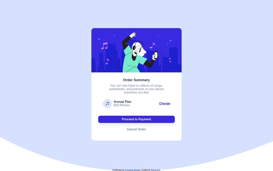
Responsive order summary card with the use of flexbox

@BishanKD

Desktop design screenshot for the Order summary component coding challenge

This is a solution for...

  • HTML
  • CSS
1newbie
View challenge

Design comparison


SolutionDesign

Solution retrospective


I appreciate any effort to point out mistakes or any suggestions or best-practices that I could have used. Thanks

Community feedback

Daniel πŸ›Έβ€’ 44,230

@danielmrz-dev

Posted

Hello @BishanKD!

In addition to all the suggestions Melvin gave you on the previous comment, you can also improve the semantics of your HTML code by wrapping the main content with main instead of div and h1 for the main title instead of h3.

These changes help you to improve the SEO optimization as well as the accessibility of your project.

I hope it helps!

Happy New Year!

Marked as helpful

1

@BishanKD

Posted

@danielmrz-dev thanks a lot for the feedback.

A very very Happy New year

1

@MelvinAguilar

Posted

Hello there πŸ‘‹. Good job on completing the challenge !

I have some suggestions about your code that might interest you.

  • Use background-size: contain; instead of cover to prevent the background image from becoming too large and distorting, as shown in the photo.
  • If you're using a background image, you can also assign a background color without conflicts. You can write background-color: hsl(225deg, 100%, 94%); to apply the challenge's background color.
  • Use background-repeat: no-repeat; to prevent the image from repeating in all directions, ensuring a single background image.
  • Employ a max-width: 400px instead of a percentage-based width to have better control over component resizing and prevent excessive growth.
  • Use min-height: 100vh instead of height. Setting the height to 100vh may result in the component being cut off on smaller screens, such as a mobile phone in landscape orientation.

I hope you find it useful! πŸ˜„ Above all, the solution you submitted is great!

Happy coding and Happy New Year! πŸŽ‰πŸŽŠπŸŽ

Marked as helpful

1

@BishanKD

Posted

@MelvinAguilar thanks a lot for the feedback. I'll look into each of the points you mentioned and try to incorporate all of them.

A very Happy New Year!

0

Please log in to post a comment

Log in with GitHub
Discord logo

Join our Discord community

Join thousands of Frontend Mentor community members taking the challenges, sharing resources, helping each other, and chatting about all things front-end!

Join our Discord