Design comparison
Community feedback
- @costelloewardPosted almost 3 years ago
Hi - this looks pretty good overall. I'd like to second James' comment about semantic html and share this cheat sheet I have found useful: https://learn-the-web.algonquindesign.ca/topics/html-semantics-cheat-sheet/
1@Ammyy9908Posted almost 3 years ago@costelloeward Thanks for sharing I will improve accessibility next time
1 - @neenrevaPosted almost 3 years ago
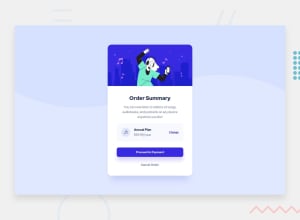
Overall this renders pretty well. The few things I see are the drop shadow on the payment button and the alignment of the card. The accessibility issues are something you'll have to add in the html. Semantic html is something I'm new to as well but you'll quickly see that it helps organize and ends up being more readable for others looking at your code. It will also help with SEO and users that may use screen readers. I'll leave a link that is a quick reference.
https://www.w3schools.com/html/html5_semantic_elements.asp
1
Please log in to post a comment
Log in with GitHubJoin our Discord community
Join thousands of Frontend Mentor community members taking the challenges, sharing resources, helping each other, and chatting about all things front-end!
Join our Discord
