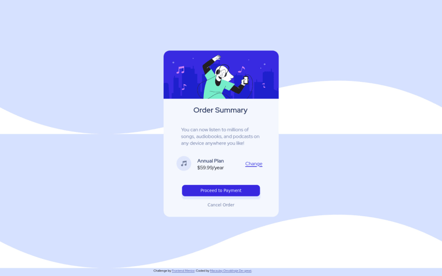
Responsive order summary card built using Html5, css, flexbox
Design comparison
Solution retrospective
It took me quite a long time to finally built it so that it will display well on mobile phones. Building the desktop display was easy but the phone display took quite some time. Everyone is a teacher and a learner. So if you have any idea on how to improve my solution, pls share. Thanks.
Community feedback
- P@12KentosPosted almost 3 years ago
Hey @MacChristo,
Projects looking good! I looked through your css and noticed something I figured I would mention. For one of the media queries you put the following code.
@media (min-width: 375px) and (max-width: 1440px) {Because you put a max-width on there, the project is losing a LOT of it's styling on my computer screen as it's resolution is set to higher than 1440. I would suggest getting rid of that constraint. If you inspect your webpage, and change to "mobile" view and increase the screen size past 1440 you will see what I'm talking about.
Secondly I noticed that the background image is repeating, if you put the following code into your body element it will fix that, as well as give the rest of the body the correct background color.
background-repeat: no-repeat; background-color: hsl(225, 100%, 94%);Keep up the great work!Marked as helpful0@MacChristoPosted almost 3 years ago@12Kentos thanks a lot. I will do just that.
0@MacChristoPosted almost 3 years ago@12Kentos Also, the attribution doesn't display well on mobile mode. Pls could you help me with some code snippets or advice to make it display nicely under the card? thank you
0
Please log in to post a comment
Log in with GitHubJoin our Discord community
Join thousands of Frontend Mentor community members taking the challenges, sharing resources, helping each other, and chatting about all things front-end!
Join our Discord
