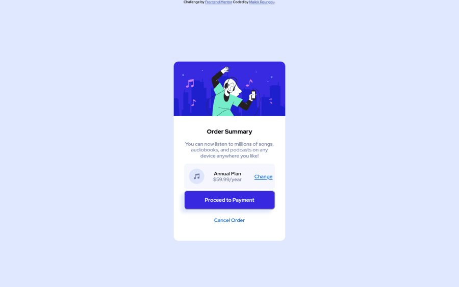
Design comparison
Solution retrospective
Hi, this is my second challenge on Front-end Mentor! Overall I think my implementation is close to the design. I wasn't able to add the overlay to the button nor "change" one you hovered on them. I'd appreciate a few pointers as to how I could implement that.
Also, though my code works, I'm sure it is not the most efficient/best way to go about things. I would also appreciate a few comments as to how I could make it better. Thanks ;)
Community feedback
- @DrougnovPosted almost 3 years ago
Hello @mroungou, Great job on the implementation.
Although, here are some things you can improve.
- Your hover effect works fine both on the change link and the button but you need to change the color too. So add
color: hsl(245, 75%, 62%);
andbackground-color: hsl(245, 75%, 62%);
respectively in the hover rules. - You need to add a background pattern as the design required. Use
background: url(./images/pattern-background-desktop.svg) no-repeat, hsl(225, 100%, 94%);
- Use
max-width
instead ofwidth
and rem instead of px for responsiveness. Then you wouldn't even need media queries for the card. - To fix accessibility issues, use
header
main
footer
etc. instead ofdiv
. And make sure to use at least one heading on a page. - Change the
h3
toh1
as you need at least one level one heading on a page.
If you need more information or help, feel free to ask or check out my solution. Have a good day my friend :)
Marked as helpful1@mroungouPosted almost 3 years agoHi @Drougnov, thank you very much for the feedback! This has been really helpful ;)
0 - Your hover effect works fine both on the change link and the button but you need to change the color too. So add
Please log in to post a comment
Log in with GitHubJoin our Discord community
Join thousands of Frontend Mentor community members taking the challenges, sharing resources, helping each other, and chatting about all things front-end!
Join our Discord