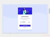
Design comparison
Community feedback
- @AdrianoEscarabotePosted almost 2 years ago
Hi Nilesh Choudhary, how are you? I really liked the result of your project, but I have some tips that I think you will enjoy:
To align some content in the center of the screen, always prefer to use
display: flex;it will make the layout more responsive!body { margin: 0; padding: 0; display: flex; align-items: center; flex-direction: column; justify-content: center; min-height: 100vh; }To improve the accessibility of the project you could have put an h1. Every page must contain a level 1 header, for people who use screen readers, identity what the main title is and follow the sequence h1-h5
<h1>Order Summary</h1>The rest is great!
I hope it helps... 👍
0 - @atif-devPosted almost 2 years ago
Hi, you did nice but you need to work on hovering states and centering the card.👍
0
Please log in to post a comment
Log in with GitHubJoin our Discord community
Join thousands of Frontend Mentor community members taking the challenges, sharing resources, helping each other, and chatting about all things front-end!
Join our Discord

