Design comparison
Community feedback
- @0xabdulkhaliqPosted over 1 year ago
Hello there 👋. Congratulations on successfully completing the challenge! 🎉
- I have other recommendations regarding your code that I believe will be of great interest to you.
HEADINGS ⚠️:
- This solution lacks usage of
<h1>so it can cause severe accessibility errors due to lack of level-one headings<h1>
- Every site must want only one
h1element identifying and describing the main content of the page.
- An
h1heading provides an important navigation point for users of assistive technologies, allowing them to easily find the main content of the page.
- So we want to add a level-one heading to improve accessibility by reading aloud the heading by screen readers, you can achieve this by adding a
sr-onlyclass to hide it from visual users (it will be useful for visually impaired users)
- Example:
<h1 class="sr-only">Order summary component</h1>
- If you have any questions or need further clarification, you can always check out
my submissionfor another challenge where i used this technique and feel free to reach out to me.
.
I hope you find this helpful 😄 Above all, the solution you submitted is great !
Happy coding!
Marked as helpful1 - @HassiaiPosted over 1 year ago
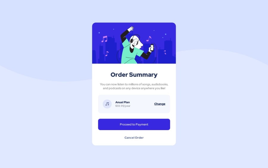
Replace <div class="container"> with the main tag, <h2> with <h1> to make the content/page accessible. click here for more on web-accessibility and semantic html
Give the alt attribute in the img a value. The value of the alt attribute is the description of the image. For decorative images like icons, there is no need to give it an alt value, for more on alt attribute Click here.
To center .container on the page using flexbox or grid instead of position: absolute.
- USING FLEXBOX: add min-height:100vh; display: flex; align-items: center: justify-content: center; to the body
body{ min-height: 100vh; display: flex; align-items: center; justify-content: center; }- USING GRID: add min-height:100vh; display: grid place-items: center to the body
body{
min-height: 100vh;
display: grid;
place-items: center;
}
Use relative units like rem or em as unit for the padding, margin, width values and preferably rem for the font-size values, instead of using px which is an absolute unit. For more on CSS units Click here and here
You forgot to give a.proceed-btn a box-shadow value
Hope am helpful.
Well done for completing this challenge. HAPPY CODING
Marked as helpful1@sandile05Posted over 1 year ago@Hassiai
Thank you for all the feedback. I've updated my code with your suggestions. I'll keep them in mind for my future projects.
1
Please log in to post a comment
Log in with GitHubJoin our Discord community
Join thousands of Frontend Mentor community members taking the challenges, sharing resources, helping each other, and chatting about all things front-end!
Join our Discord
