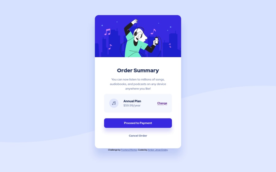
Responsive Order Component with CSS Flexbox and Grid
Design comparison
Solution retrospective
This is my first submitted solution! All feedback is greatly welcome. Does anyone have a good tip or strategy for knowing what to use for your sizing units and when? With the Figma file I was able to know exactly what some heights and widths should be, but for responsiveness, should everything be relative only (like rem, em, percentages, and vw/vh)? Or are using pixels, especially for font sizes, usually okay? Thanks!
Community feedback
- P@kens-visualsPosted over 3 years ago
Hey @amberensley 👋🏻
I have some feedback for the project.
- For the music icon, add
aria-hidden="true”, because it's for decoration. You can read more aboutaria-hiddenhere. - Hero image should have a
display: block;, it removes the line underneath the image. If you want to know what's causing it, check out the 3rd section of this video - Also, I suggest adding
transition: all 0.2s;to the button and the links, this will make:hoversmoother. - I won't go into many details about resetting CSS, but I'll leave this cool article here, which will make more sense than my brief explanation.
- Lastly, let's bring the card to the center of the screen, just add
min-height: 100vhto the body, and you're good to go.
I hope this was helpful 👨🏻💻 to answer to your question, I'd say in my opinion it's good to use relative units for the most of the stuff, because fixed units are not good if you're trying to build a responsive website or even a small component. Other than that, you did a great job with your first project, well done. Cheers 👾
Marked as helpful1@amber-jenae-ensleyPosted over 3 years ago@kens-visuals thanks so much! Your feedback is very clear and easy to understand and super helpful! I will read and watch these links and fix my solution accordingly. Also with the relative units, is it okay that I sometimes used rem in my solution but also sometimes used percentages? Or is it better to be consistent and just use one kind of relative unit?
0P@kens-visualsPosted over 3 years ago@amber-jenae-ensley you're welcome 😇 no absolutely okay, everyone does it, there's no way to stick to one unit and build the whole project upon it.
0 - For the music icon, add
Please log in to post a comment
Log in with GitHubJoin our Discord community
Join thousands of Frontend Mentor community members taking the challenges, sharing resources, helping each other, and chatting about all things front-end!
Join our Discord
