Design comparison
SolutionDesign
Solution retrospective
What are you most proud of, and what would you do differently next time?
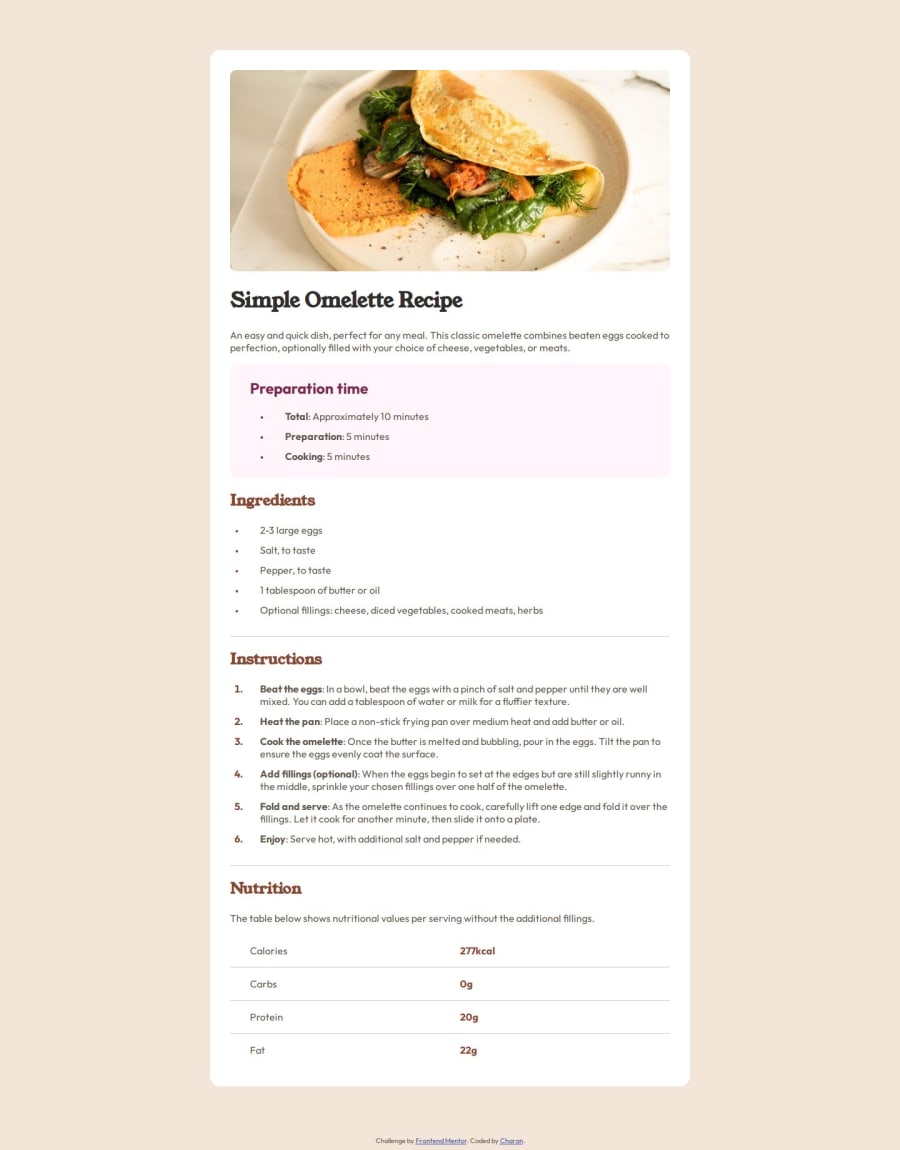
I feel really good at being able to finish this challenge in a, comparatively, short amount of time. This challenge allowed me to practice semantic HTML that I learnt a while ago.
What specific areas of your project would you like help with?The padding... I kept experimenting with the paddings and the border-radius until they looked right. How did you all figure how to get the padding right, without the design files? Is there a standard a recommend UI/UX practice/rule/guideline sort of thing that we can use to guess them right, every time?
Community feedback
Please log in to post a comment
Log in with GitHubJoin our Discord community
Join thousands of Frontend Mentor community members taking the challenges, sharing resources, helping each other, and chatting about all things front-end!
Join our Discord
