Not Found
Not Found
Not Found
Not Found
Not Found
Not Found
Not Found
Not Found
Not Found
Not Found
Not Found
Not Found
Not Found
Not Found
Not Found
Not Found
Not Found
Not Found
Not Found
Not Found

Submitted

Responsive Omelette Menu

José Mama 150

@codesByJose

Desktop design screenshot for the Recipe page coding challenge

This is a solution for...

  • HTML
  • CSS
1newbie
View challenge

Design comparison


SolutionDesign

Solution retrospective


What are you most proud of, and what would you do differently next time?

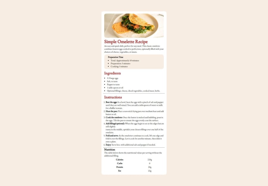
made the required adjustments!.. this was one difficult task for me, but im glad it pulled through.. pls do leave your thoughts concerning this

Community feedback

@ArinzeGit

Posted

I sent an initial comment but I’m just realizing it didn’t send (that’s why the second comment began with “also”). I’m gonna send it again now. Here it goes:

Jose mama! Agba dev! You’re doing well. For future projects try to follow the design spec more closely e.g font family, font size, font color and layout so that the comparison slider will be more matching. You got this💪🏽

Marked as helpful

0

José Mama 150

@codesByJose

Posted

i hear you my lord!!!!!!! @ArinzeGit

0

@ArinzeGit

Posted

Also. I suggest you add a README file to the GitHub repo of this project. You can use the template provided in the challenge repo you got from frontend mentor upon starting the challenge. The template will guide you to add overview ,screenshots, link to live site, what you learned, continued development, useful resources, author… An informative README that provides context is always nice for a GitHub repo. Keep pushing💪🏽 you got this.

Marked as helpful

0

José Mama 150

@codesByJose

Posted

thanks dadddy! @ArinzeGit

0

@Mohammad-Moneer

Posted

Hello there, You made a good solution 👍 Your code is well-structured and easy to read.

Suggestions for Improvement:

  • The use of HTML5 semantic elements (<section>, <h1>, <h2>, <h3>, <ul>, <ol>, <table>) is good. However, wrapping the content inside multiple <div> elements instead of using more semantic tags (like <main>, <article>) can be improved for better readability and SEO. For example: You could replace the element <div class="container"> with <main class="container"> and also the element <div class="innerCont"> could be <article class="innerCont">

  • The width of the <div class="container"> should be larger to match the design.

  • The font size of the headings and body text should be adjusted to match the design.

  • The image dimensions are explicitly set with width="320px" and height="130px", which might distort the image. It's better to use CSS to set a width of 100% for responsive designs.

Overall, your project is well-structured and follows a clear layout. I hope you find these suggestions helpful.

Marked as helpful

0

José Mama 150

@codesByJose

Posted

i will make the due improvements.. thanks! @Mohammad-Moneer

0

@Supa-Thobile2

Posted

The code base is easy to read and follow.

The design could be greatly improved with margins and padding.

The design is close to the one on design assets but it could be improved.

The readability of text on the small screen is a strenuous exercise. The fonts can be increased for better readability.

Marked as helpful

0

José Mama 150

@codesByJose

Posted

yes thanks u very much! @Supa-Thobile2

0

Please log in to post a comment

Log in with GitHub
Discord logo

Join our Discord community

Join thousands of Frontend Mentor community members taking the challenges, sharing resources, helping each other, and chatting about all things front-end!

Join our Discord