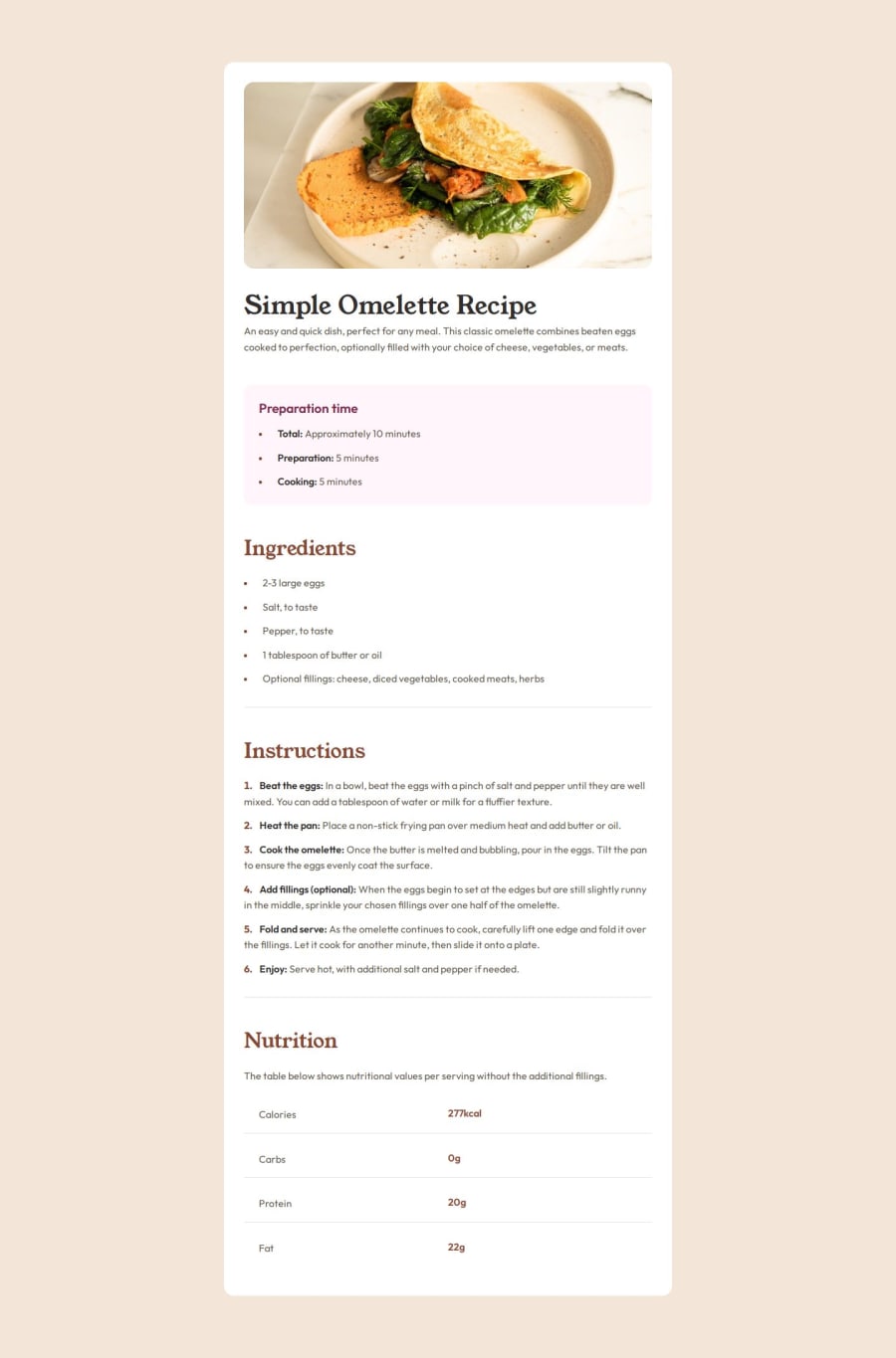
Responsive omelette article challenge


Design comparison

Solution retrospective
I would create a spacing system variables so I won't forget the sizing, and make everything consistent.
What challenges did you encounter, and how did you overcome them?I used javascript to move the image outside of the container, on smaller screens. Because using position absolute would overlap the content of the container behind the image.
The second challenge was to add spacing to the markers or number of ol, ul. I started with:
ul li::marker, but it didn't work, because as I figured out before the spacing for this tag is not supported in every browser.
So I've decided to add spacing to each individual first child element inside the li: ul li :first-child { padding-left: 0.5rem; }
What specific areas of your project would you like help with?Is it possible with pure CSS to make it similar to the solution example where the image is outside of the article container?
Community feedback
- @CarlosLDCPosted about 2 months ago
I'm really impressed with your elegant solution to this challenge. The way you handled the fonts was particularly well done. You have a great eye for detail and your code is clean and easy to read. Awesome job!
Marked as helpful0@Ilay-IlayPosted about 2 months ago@CarlosLDC Thank you for the good words, Carlos!
0

Please log in to post a comment
Log in with GitHubJoin our Discord community
Join thousands of Frontend Mentor community members taking the challenges, sharing resources, helping each other, and chatting about all things front-end!
Join our Discord