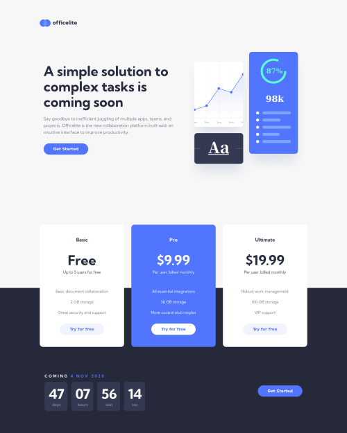
Design comparison
Solution retrospective
Hi everyone!
I just completed another challenge Alhamdoulillah ❤️.
Please let me know about any issues you may find and how I can improve my solution & my code. I'm always open for your feedback (;.
Have a nice day!!
Community feedback
- @grace-snowPosted over 2 years ago
Hi there
Overall this looks good but content is overflowing my mobile screen slightly at the sides. I haven't examined css in this but that is often caused by either explicit widths/min-widths, or lack of paddings/margin
More important learning points for you at the moment are around html Though:
- use a main landmark for page content rather than nesting sections as children of the body
- look up how to make forms accessibile. Lots of very important things to learn there. Your forms are missing loads of essentials at the moment like labels and validation
- related - you can't build a fake select like that, the keyboard controls etc are totally different and it won't work for all users. Styling native selects is really limited but there are some third party versions you could include.
- use button elements for form submits, not the legacy input type submit
- use more appropriate semantic elements: eg in the carda, the list of benefits are lists not paragraphs
- look up how and when to write good alt text on images and when to leave it Blank
- use the date time element for dates
- rethink the html and accessibility in particular on the countdown timer when you implement it. You might want the cards to be aria hidden, but have an understandable date in there for screenreaders that updates every minute or day etc - that would need aria live on it if you went down that route
Last thing - really important to restore the gitignore in your repo!. Then delete node modules and ds store and repush to remove them from tracking. Then npm install on your local again. They should never be on your remote repo, only local
Marked as helpful1 - @codezelossPosted over 2 years ago
Hello Grace ! I hope you're doing well!! Thank you so much for your report & your analysis, it really shows that you have giver time to read my code...! Later I will work on all the points you mentioned inchallah, and of course I will try to pay attention to them in future projects. All the points you mentioned are really useful, through it I concluded that not only the Visual that matter to complete the project, but also writing CLEAN and complete code. Thanks again Grace, have a nice day!
0
Please log in to post a comment
Log in with GitHubJoin our Discord community
Join thousands of Frontend Mentor community members taking the challenges, sharing resources, helping each other, and chatting about all things front-end!
Join our Discord