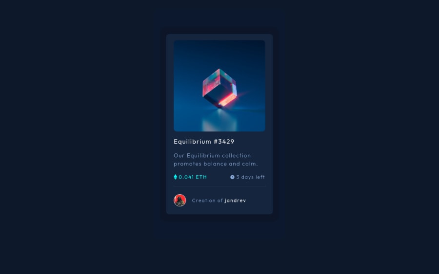
Responsive NTF card component using plain HTML and CSS
Design comparison
Solution retrospective
Hello there! I got in quite a lot of trouble determining when I should use an ID and when I should use a class. How can I optimize my use of IDs and classes? Another thing that bugged me is that I had to nest three divs to create the shadow of the main card. How can I improve the creation of these shadows? I tried using box-shadow, but I could not control the width and height of the shadow.
Community feedback
- @d4lbitPosted almost 3 years ago
Hi! Usually ids are used only one element and classes on multiple elements :) Also remember that when applying CSS ids have priority over classes. As for the shadow, you can just apply it on the outer parent div of the card. From my newbie point of view I found your HTML a bit 'too messy': you could have done your card with less divs. But it's a good try anyway! If you have troubles with CSS I suggest you visiting CSS Tricks, it may help you :)
Keep going, it's going to be easier!
1 - @AgataLiberskaPosted almost 3 years ago
Hi @jandrev! Nice work here :)
- In general, it's best to stick to classes when styling. Id's have a higher specificity than classes, which can have some unexpected results and is trickier to maintain (but they do come in handy for working on very large sites when you want to make sure you don't change something accidentally).
- For shadows, definitely use
box-shadow
. You can control the height and width with offset values - and keep in mind that those nice soft shadows you see on websites are most likely multiple shadows on top of each other. Check out this website for some great examples - Additionally, it would be good to have some more semantic html tags here - definitely a
<main>
(that's the issue that is showing up in the report), you could also use<article>
for the card itself. - I can see you set up the height of the card element - it's really unnecessary here - it's a lot better to control the width with specific values and then let the content decide the height.
- Make sure the alt text for your images is meaningful - describe what you can see in the image :)
Hope this helps! :)
1
Please log in to post a comment
Log in with GitHubJoin our Discord community
Join thousands of Frontend Mentor community members taking the challenges, sharing resources, helping each other, and chatting about all things front-end!
Join our Discord