Responsive Notifications Page With Individual Mark & Unmark As Read
Design comparison
Solution retrospective
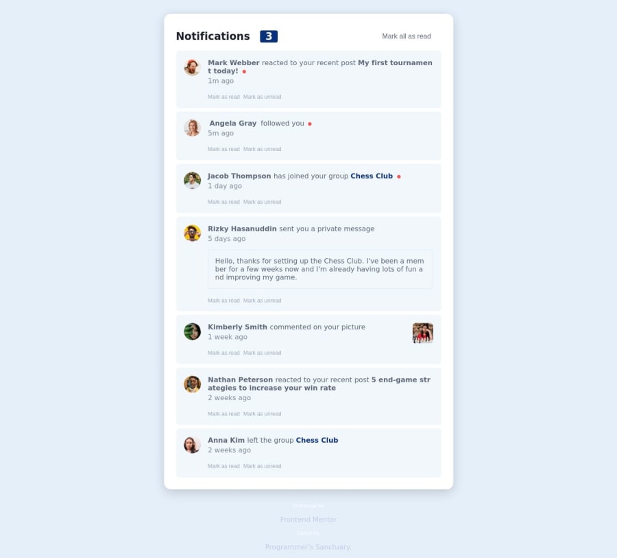
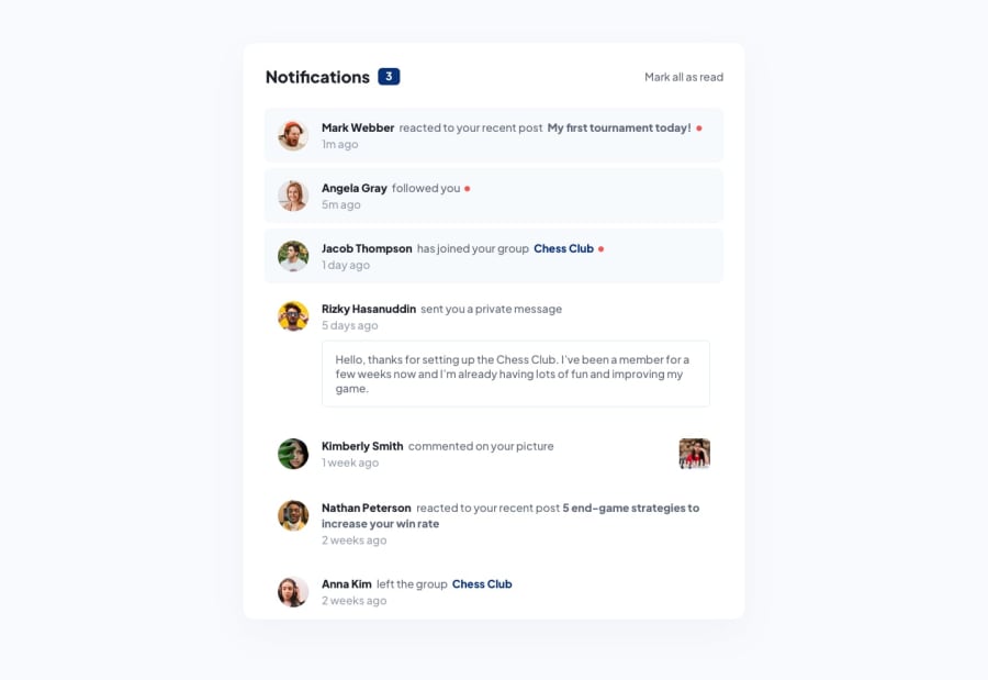
This was a bit more challenging as I did not think about the layout first and coded everything right off the bat. Because of that, I encountered a setback, which was that the message preview should be inside the notification title and the profile image should be outside of that. I did resolve it, and it was fun!
I am getting design ideas just by writing the solutions for these problems, and it's amazing!
The most difficult part would be the layout of the notification card since you need to think about how the contents are laid out.
I added an individual functionality for marking a notification as read and unread to make it seem more interactive since I love coding interactive interfaces.
Community feedback
Please log in to post a comment
Log in with GitHubJoin our Discord community
Join thousands of Frontend Mentor community members taking the challenges, sharing resources, helping each other, and chatting about all things front-end!
Join our Discord
