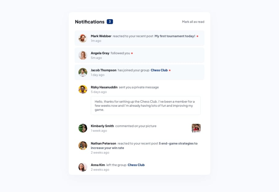
Design comparison
SolutionDesign
Solution retrospective
What are you most proud of, and what would you do differently next time?
Hello everyone 🗿
This challenge gave me some headache from looking at the design because i saw some inconsistency in term of spacings between certain elements. Anyway, i picked a rock and ate it (not really, should i pick a frog?).
🌱 Built with
- Mobile-first workflow
- Semantic HTML
- Pure CSS
- Vanilla JavaScript
📝 What i have done
- Made the solution as close to the design as possible.
- Added custom effects on interactive elements.
The challenge was there, but i overcame it anyway.
What specific areas of your project would you like help with?Would love to hear your opinions on any topic.
Community feedback
- @saularangurenPosted 4 months ago
God job bro
0
Please log in to post a comment
Log in with GitHubJoin our Discord community
Join thousands of Frontend Mentor community members taking the challenges, sharing resources, helping each other, and chatting about all things front-end!
Join our Discord
