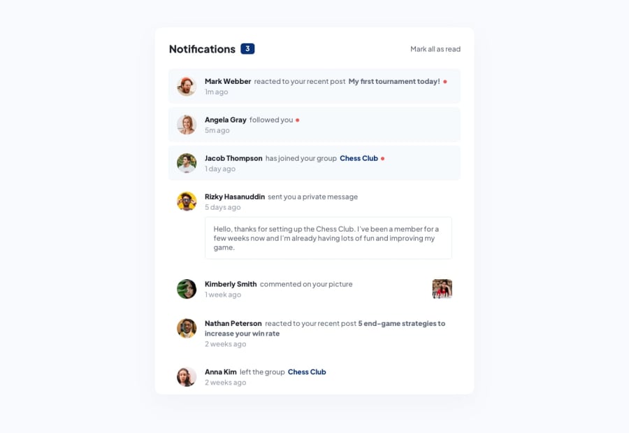
Responsive Notifications Page using jQuery and JavaScript for notis
Design comparison
Solution retrospective
Hello!
I hope you enjoy the website I made; some questions I still have:
- When I was putting the red dots for the unmarked notifications, I created a nested span element and turned the opacity on and off. In doing so, I had a hard time lining the span element up with the text and ended up not doing so because I think the design I have now looks better; however, I would still like to know how to line up my dot with the text. Can anyone help me with this?
- I tried commenting my code very well and using proper semantics for my HTML; did I use sufficient semantics and comments in my code?
- My responsive design works well up until about 900px, but then the widths of my banners exceed the width of the body. Does anyone have advice for how to get around this issue?
If you can help with any of these questions, that would be wonderful! If not, thank you for stopping by!
Community feedback
- @wilderav86Posted over 2 years ago
Hey Elias,
I think I figured out a couple of your problems.
For the span tags: It looks like they have the letter 'r' in them, throwing it off. When I removed the 'r' in dev tools, they lined right up!
For the banner widths under 900px: I think this has something to do with the width of your main tag. If I remove the 45vw width on the main tag it seems to work better at lower resolutions.
HTML looks good to me but consider using a footer tag for the div at the bottom with the class 'attribution'. It's another landmark tag similar to 'main' or 'section'. You might also want to use a more descriptive alt tag on your images as well.
Hope this helps and great job otherwise!
Marked as helpful1
Please log in to post a comment
Log in with GitHubJoin our Discord community
Join thousands of Frontend Mentor community members taking the challenges, sharing resources, helping each other, and chatting about all things front-end!
Join our Discord
