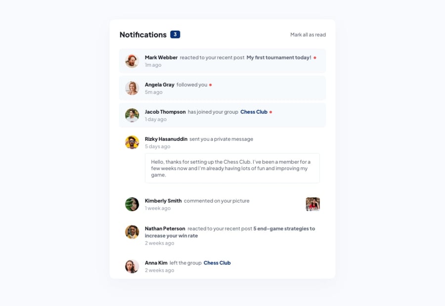
Design comparison
Solution retrospective
Any feedback would be much appreciated :)
Community feedback
- @Susu-specPosted about 1 year ago
Hey! Looks good! Although, I think the border line should be reduced by a wee bit and possibly set a fixed width and auto height on the avatar images (I think that would work for all the images. Great job! :) I looked into the code too and a bit of a tip, setting pixels for padding and margins make the page less responsive. ems and rems are nicer alternatives since they're relative values.
0 - @BashamegaPosted about 1 year ago
Hello:) It looks great. I just noticed that the red dot on the unread messages is not showing, second I think it would be better if you can add some functionality to make the
mark as readbutton working. Other than that, keep it up!0
Please log in to post a comment
Log in with GitHubJoin our Discord community
Join thousands of Frontend Mentor community members taking the challenges, sharing resources, helping each other, and chatting about all things front-end!
Join our Discord
