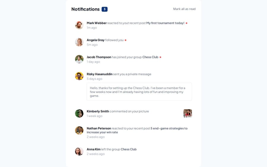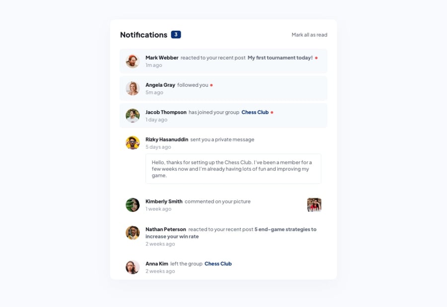
Design comparison
Solution retrospective
Making the different styles based on the type of notification was kind of what made me lose a bit of time, but I could get it to work in a way that is reusable. I would probably want to polish my BEM markup on the next challenge.
What challenges did you encounter, and how did you overcome them?It was a pretty simple layout to build and there was no secret on making the interactivity work, therefore I had no struggles this time.
Community feedback
- @Alex-Archer-IPosted 8 months ago
Hey!
Great work! It's cool that you use bundlers (I personally prefer Vite).
The thing I wanted to notice that you slightly skip the design idea - all clickable elements (I mean names, pictures, comment titles and stuff) are links, so they all should be
aelements.By the way, in BEM you shouldn't write like this
notification__author__pictureornotification__author__name. There shouldn't be element inside element. If you want to write double-word name than it looks like thisnotification__author-name.Overall, that cool! Keep doing =)
Marked as helpful1@Artur-NeriPosted 8 months agoOh... I think I focused so much on my goal of finishing yesterday that I didn't even think about thinking about the clickable elements. And read that just blew my mind lol.
OH, that explains why I was feeling like the markup was poluted.
Thank you for all the advice, Alex!
1@Alex-Archer-IPosted 8 months ago@Artur-Neri
Haha, yeah, I can understand what happened when trying to fit in deadline even for yourself 😅
And when I started to use BEM I also wrote something like "card__item__title__name" 😄
0
Please log in to post a comment
Log in with GitHubJoin our Discord community
Join thousands of Frontend Mentor community members taking the challenges, sharing resources, helping each other, and chatting about all things front-end!
Join our Discord
