Responsive Notifications in React + Cloudinary + Animation + Axios
Design comparison
Solution retrospective
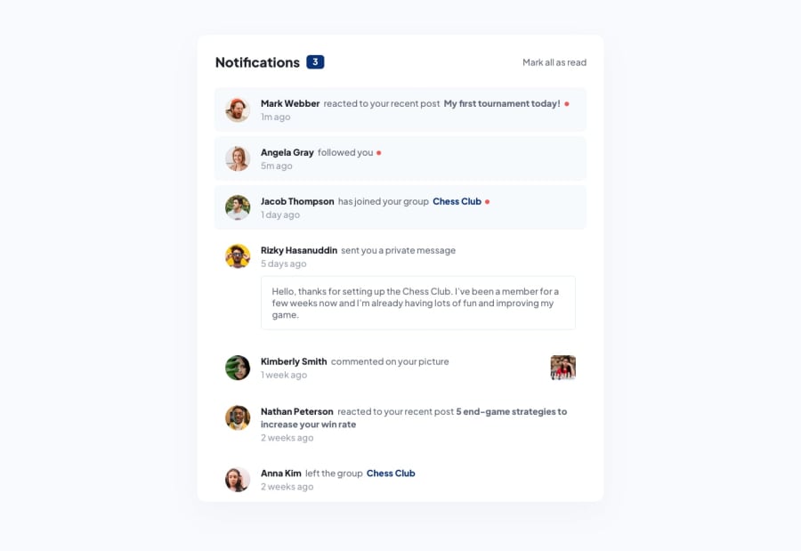
In this challenge, i've tried to build it as dynamic as possible. JSON Data is hosted online for free, which includes links to image assets that are hosted on Cloudinary CDN Platform. In my app, i'm fetching the data using axios library. Finally, i've added some little animation using framer-motion. Hope you guys like my solution! :)
Community feedback
- @ApplePieGiraffePosted almost 2 years ago
Greetings, visualdennis! 👋
Awesome job on this challenge! 👏 Your solution looks great and I like the onload animation that you added to the notifications! 👍 It's great that you used a variety of tools to create your solution, too. 🙌
Small note—all of the bolded words in the notifications should be links. Even though they do not actually go anywhere in this challenge, in a real-life application they would most likely navigate the user to another page, so using link tags for those elements would be best for semantics and accessibility (especially considering you have already given them a hover state). 😉
I also noticed that you used
pxfor the values of many things such as font-size, margin, and padding. It is a best practice to use a responsive unit such asemorreminstead because those units are based on the font-size of the document and allow users to increase/decrease the size of text (and the overall design, if you use those units correctly) by changing the font-size of their browser (which is important for accessibility reasons). If you'd like to learn more about those units in CSS and how all of this works, check out this helpful video.Hope this helps. 😊
Keep coding (and happy coding, too)! 😁
Marked as helpful2P@visualdennissPosted almost 2 years ago@ApplePieGiraffe Hi,
I definitely agree that those p tags should be <a>, even in the JSON data i've named one of them as link. I noticed that i need to change all of them when i at the final stage of the challenge and since this is just for my own practice, i did not want to spend any extra time on this and was too lazy to refactor all those p's into a's and make extra changes in css too. But i'm certainly aware of that thing and would def use a tag in a real-world application.
I've used em for font-size, but for the rest used px for my own convenience, as you also noticed. All those units and best practices are something that i'vent dealt in depth yet but was planning to, so thanks for highlighting the issue and for the resource. I think to convert to em, i'd have to calculate its percentage to base size ? , so that sounded a lot of work for me for every single px value..I've have to admit i was too lazy for that
Thanks for taking your time to pointing out those issues with sematinc tags and units, good catch! Appreciate your feedback.
1@ApplePieGiraffePosted almost 2 years ago@visualdenniss
No problem! 👍
I think it's worth taking a little extra time to make your solutions accessible and look into using best practices, as paying attention to detail and writing high-quality code are two great characteristics for developers to have. This will especially be helpful for projects you want to showcase to demonstrate your skills. 😉 Just a thought! 🙂
1
Please log in to post a comment
Log in with GitHubJoin our Discord community
Join thousands of Frontend Mentor community members taking the challenges, sharing resources, helping each other, and chatting about all things front-end!
Join our Discord
