Design comparison
SolutionDesign
Solution retrospective
Hey there Frontend Mentor Community!
Back with a solution for the notifications page!
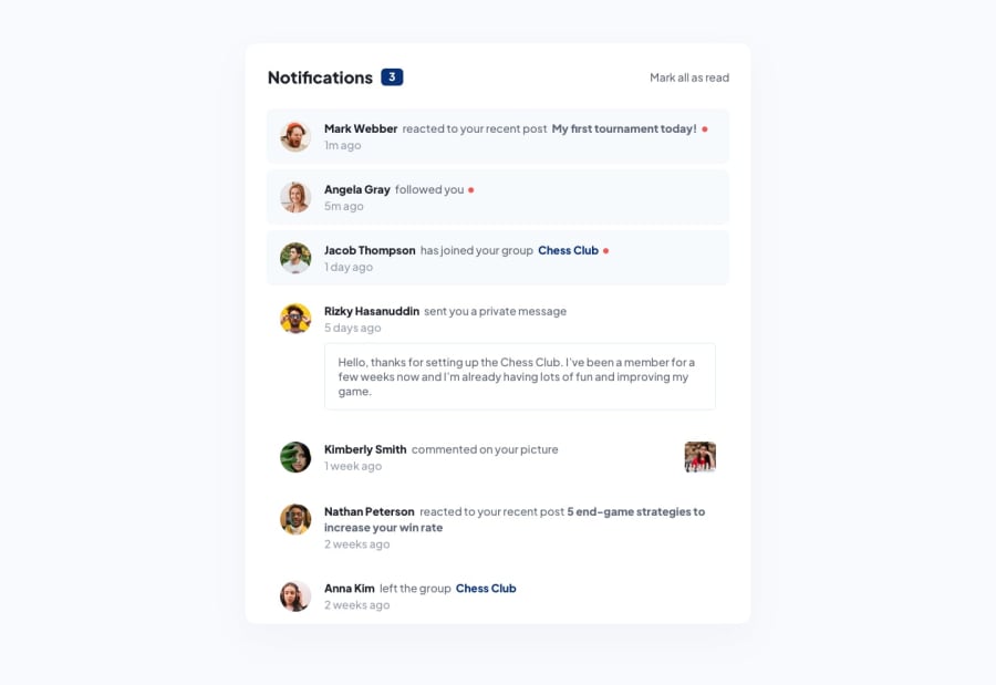
During this solution I did come across some minor problems in designing with CSS where I would like your feedback on the following if possible:
- Is there a way to center Nathan Peterson's profile picture with the notification content and the time posted without adjusting the CSS of that one specific notification?
- How would you design the text showing the number of unread notifications so it looks as close to the design as possible?
P.S I am open to any other feedback you guys have to give.
Happy Coding!
Community feedback
Please log in to post a comment
Log in with GitHubJoin our Discord community
Join thousands of Frontend Mentor community members taking the challenges, sharing resources, helping each other, and chatting about all things front-end!
Join our Discord
