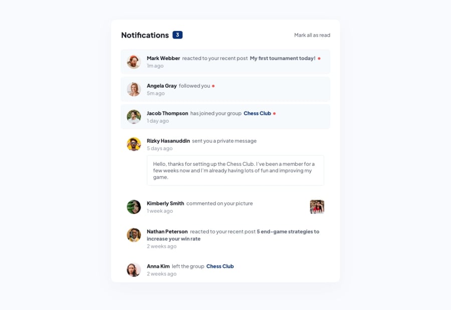
Design comparison
SolutionDesign
Solution retrospective
thanks
Community feedback
- @jumaelmartinsPosted almost 2 years ago
Hello Friend, it's cool, follow some feedbacks to further improve your code. missed do hover interactions with css. check in the "active-states.jpg" file. one of the things that is requested in the challenge is for the user to click the "mark all as read" button on the zero notification counter. I also checked that the HTML is all done with divs and span, this is not a good practice, because it makes accessibility difficult for people with disabilities who use screen readers. try to take a look at the semantic tags of the html.
0
Please log in to post a comment
Log in with GitHubJoin our Discord community
Join thousands of Frontend Mentor community members taking the challenges, sharing resources, helping each other, and chatting about all things front-end!
Join our Discord
