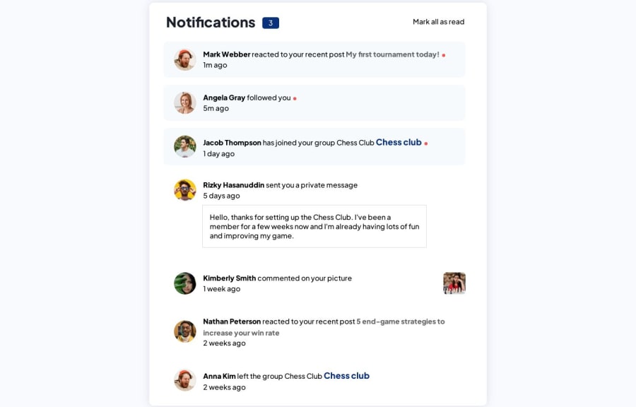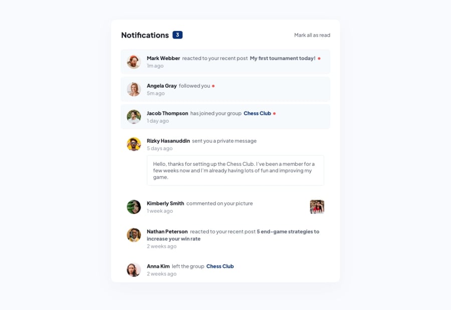
Responsive Notification-page without js
Design comparison
Solution retrospective
❗❗❗❗❗❗ Hello,
🚨🚨 Day 2 of tips and tricks! 🚨🚨
If you haven't checked out my previous challenge, you really should. I provide you with really good information that will help you with responsiveness.
Today, I tried something different. Instead of doing everything at once, like working on the HTML and CSS together, I took a different approach. I focused on the HTML first, just like in the old days when there was no CSS. As there is no CSS, the page is responsive by default. That's why I tried HTML first. After completing the HTML, I worked on the CSS, starting with typography and then moving on to classes. It has been really helpful for me, and I highly recommend you give it a try.
That's it for today. Stay tuned! I'll try my best to complete a challenge every day 😊 If you found this helpful, don't forget to follow me and check out the other challenges.
Community feedback
Please log in to post a comment
Log in with GitHubJoin our Discord community
Join thousands of Frontend Mentor community members taking the challenges, sharing resources, helping each other, and chatting about all things front-end!
Join our Discord
