Submitted over 1 year ago
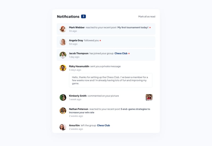
responsive notification page using tailiwindcss and javascript
@oseji
Design comparison
SolutionDesign
Solution retrospective
i had an issue implementing the red unread markers because i used flex to organize the notification content,how else could i hace implemented this?
Community feedback
- @CamronWithrowPosted over 1 year ago
Hi!
I used flexbox as well for this challenge. To get the red "unread-notification" icon, I used
::afterto style an icon after the notification message.Using your classes, I think it would look something like this:
.unread .notiftext::after { content: ""; height: 0.25rem; width: 0.25rem; background-color: red; border-radius: 50%; }Marked as helpful0
Please log in to post a comment
Log in with GitHubJoin our Discord community
Join thousands of Frontend Mentor community members taking the challenges, sharing resources, helping each other, and chatting about all things front-end!
Join our Discord
