Submitted about 2 years ago
Responsive notification page developed using Angular, TS & SCSS
@paryanimohit1
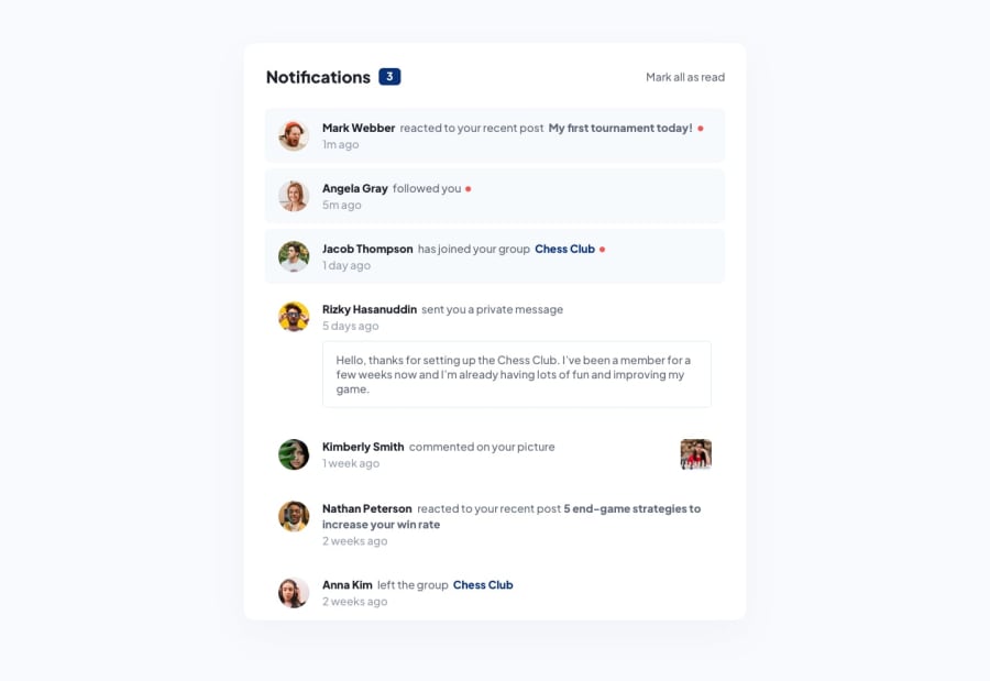
Design comparison
SolutionDesign
Solution retrospective
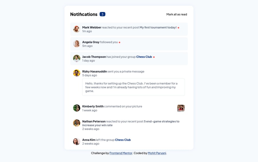
I've developed the solution using Angular, TS & SCSS.
I've used 2 components viz., AppComponent for the overall layout and NotificationComponent for notification content.
The notifications data is maintained in a separate file named data.ts.
Maintaining variables in a file named vars.scss.
Maintaining an interface for notification data objects in a file named interfaces.ts
Functionality:
- Mobile responsive solution
- Unread notifications have a red circle and different background color.
- Unread notifications are clickable and clicking one will mark it as read and update the unread notification count.
- Mark all as read will set all the notifications as read.
- Hover effects are added.
I've tried to match the designs as much as possible, the only part I am unsure about are some of the lighter colors & background colors.
- Do I need any improvements with the folder structure?
- Let me know how did I do overall considering best practices?
- Would you suggest any improvements in any other area like, approach, code, folder structure, styling, best practices, or anything?
Community feedback
Please log in to post a comment
Log in with GitHubJoin our Discord community
Join thousands of Frontend Mentor community members taking the challenges, sharing resources, helping each other, and chatting about all things front-end!
Join our Discord
