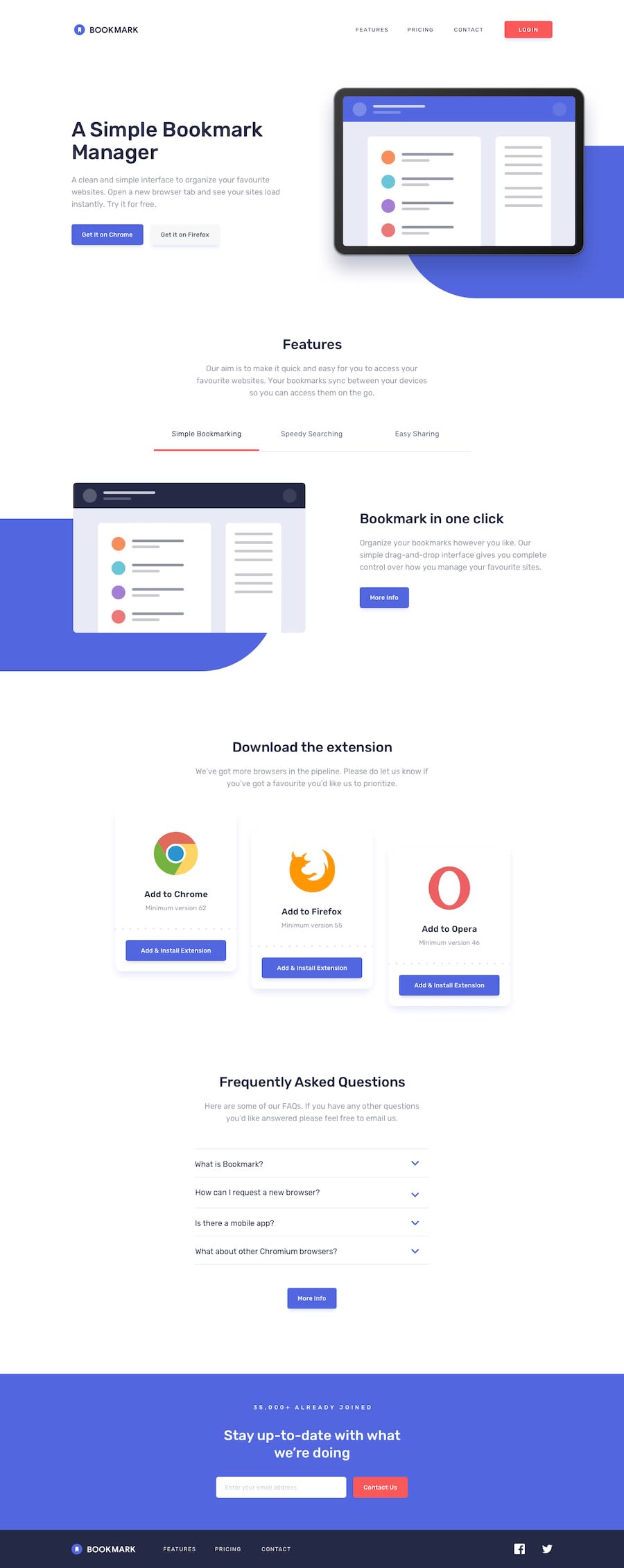
Design comparison
Solution retrospective
i dont know how to make custom width border bottom on Features List at mobile version. so i decided to use ::after pseudoclass but yah it can't styled each one. when i click on one of them, all of them will applying ::after pseudoclass even i use looping
*im sorry for my bad english
Community feedback
- @FluffyKasPosted almost 3 years ago
Hiyo,
Let me start by saying your website looks really awesome! Very neat, works well on all screen sizes! My only problem with it is your HTML, which is a bit of a mess (I suppose you can see this by the amount of issues you have in your report). Making a website look good is one thing, but you should also make sure it's accessible for everyone. ^^ To fix these issues, I have some suggestions:
-
You could wrap your mobile menu in a
header
instead of adiv
. There can be more than oneheader
element in your website, fortunately. -
All your sections should be wrapped in a
main
, as that's the main content of your website. -
LOGIN button. You used 2 different elements for it, a
div
with ah1
for the mobile and ana
for the desktop view. It should be either ana
or a button, but using a div and styling it like a button is definitely incorrect. -
Hamburger menu: this is supposed to be a button, so wrap the
img
in a button element and give it an aria-label="Toggle mobile menu" to make it obvious what it does even for people who can't see it (using an alt of hamburger isn't very helpful, is it). -
All your nav menus could contain a
ul
for your links. -
I'm not going to point out all the incorrect alt texts, I'll just leave this helpful article here. :) This is all you need to know to write better alt texts in the future ^^
-
Heading levels: they're all over the place. You could watch this video, this shows very well why using the correct headings is very important.
-
Chrome and Firefox buttons: again, please use
button
element for buttons. You can't just style a div and call it a button :) -
FAQ: please wrap your images in button elements. You can style them with CSS later.
-
Social media links: wrap them in
a
tags, they're links :) Don't forget to use aria-label with them as well, as they don't have a text description.
That should be most of the semantic issues. I can see that you're already very good at making things look great but I warmly suggest you read a bit about semantic elements and accessibility, those are important aspect of our job as well! I leave an extra video here for you, this is a good place to start. The articles from Scott O'Hara are also super helpful.
+1 tiny issue I found: your Contact Us "button" (please use a button here too :D) "jumps around" a bit when hovered. This is because it has a small border on hover but none when it's not hovered. Giving it a border unhovered and setting it's opacity to 0 would get rid of this problem ^^
Apart from this, I think what you did here is really impressive, especially considering you didn't use any frameworks! I'm gonna bookmark your solution for sure, as a reference for later. ^^ Just read a bit about semantic HTML and accessibility, and you're good to go.
Good luck :)
1@titocsPosted almost 3 years agoHi @FluffyKas, speechleess. I just found out now that writing HTML shouldnt be arbitrary. lots of little things to watch out for. in the future, i will be more disciplined in making projects especially on semantic.
THANK YOU VERY MUCHH !!!
0 -
- @DrMESAZIMPosted almost 3 years ago
hi @titocs. I very impressed I am going to surely us this work as my guideline to do similar landing page
0@titocsPosted almost 3 years agohi @DrMESAZIM , okeey but there's some little bug in it but i'll fix it asap
0 - @argelomnesPosted almost 3 years ago
Hey @titocs ,
I’ve taken this challenge and also used pseudo-class for the list. You need to add
width: 100%;
in your:after
so the borders take up the whole space.0@titocsPosted almost 3 years agohi @argelomnes , thanks for your feedback. if i set the width of it by 100%, it will different from guideline image :(
0@argelomnesPosted almost 3 years ago@titocs You're right! Sorry, I misunderstood your question. I viewed again your work and understand now what you meant. On desktop,
.borderSliderBottom
is applied when the tab is clicked affecting the border-bottom property. On mobile, do the same. But this time affecting::after
.So you should already have the styles applied to
::after
even before the tab gets tapped. Usetransparent
for background and then change it tovar(--Soft-Red)
when its parent has.borderSliderBottom
.0@titocsPosted almost 3 years ago@argelomnes previously i had thought that the same method could be used for mobile, but after see on stackoverflow i found that a pseudo-element is not part of the DOM. therefore, i cannot selecting ::after element on Javascript.
But i try to learn it from your project
0
Please log in to post a comment
Log in with GitHubJoin our Discord community
Join thousands of Frontend Mentor community members taking the challenges, sharing resources, helping each other, and chatting about all things front-end!
Join our Discord