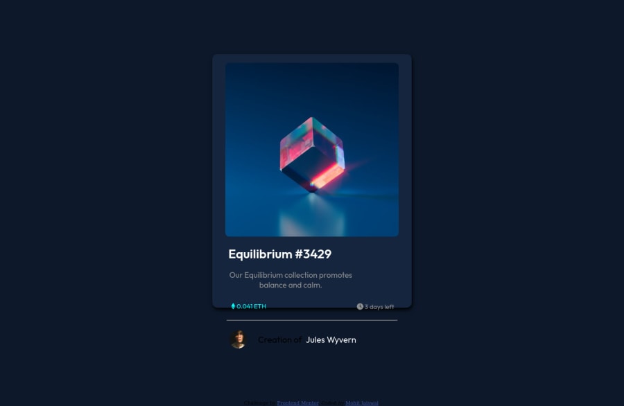
Design comparison
Community feedback
- @denieldenPosted over 2 years ago
Hi Mohit, I took some time to look at your solution and you did a great job!
Also I have some tips for improving your code:
- You can add the effect
:hovercreating adivthat appears on hover. I used tailwind but you can still see and understand which css properties you can use to do the same. Look here -> my solution - to make it look as close to the design as possible set
width: 20remtocardclass - remove all
marginfromcardclass - try to use flexbox to the body for center the card. Read here -> best flex guide
- after, add
min-height: 100vhto body because Flexbox aligns child items to the size of the parent container - try to add a little
transitionon the element with hover effect
Overall you did well 😉
Hope this help and happy coding!
Marked as helpful1@mohit421Posted over 2 years ago@denielden This time i just tried it all without using grid and flexbox . thanks for your feedback. I have a question , Can i submit two solution for same challenge?
1@mohit421Posted over 2 years ago@denielden Can you tell me, why above design not matches whereas i check all breakpoint on chrome developer it work fine .
1@denieldenPosted over 2 years ago@mohit421 You can present all the solutions you want for a challenge.
0@denieldenPosted over 2 years ago@mohit421 It doesn't match because the screenshot generator has a resolution where it looks like this. You can check this by setting a resolution such as
1200x500on the developer toolMarked as helpful1 - You can add the effect
Please log in to post a comment
Log in with GitHubJoin our Discord community
Join thousands of Frontend Mentor community members taking the challenges, sharing resources, helping each other, and chatting about all things front-end!
Join our Discord
