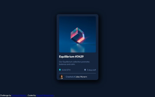
Submitted about 1 year agoA solution to the NFT preview card component challenge
Responsive Nft Preview Card with Hover Effect
@YussefMo

Solution retrospective
What are you most proud of, and what would you do differently next time?
That i used % for every width and margin padding left or right and becous of that my media query wath just adjasting the main card width and every thing els is automatically adjasting with the card
Code
Loading...
Please log in to post a comment
Log in with GitHubCommunity feedback
No feedback yet. Be the first to give feedback on Youssef Mohammed's solution.
Join our Discord community
Join thousands of Frontend Mentor community members taking the challenges, sharing resources, helping each other, and chatting about all things front-end!
Join our Discord