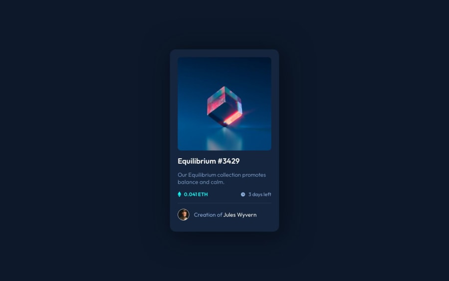
Design comparison
SolutionDesign
Solution retrospective
Any feedback is appreciated, Thank you!
Community feedback
- @fernandolapazPosted over 1 year ago
Hi 👋🏻, some of this may interest you:
- The image is interactive too, so it should be wrapped with
<a>or<button>(depending on what happened when clicking on it).
- The icons are decorative and therefore need an
empty altattribute to be ignored by screen readers.
- It is better to use
min-height: 100vhfor the body as usingheightcauses the page to be cut off in viewports with small height (such as mobile landscape orientation).
- Think about using relative units since they are better for scalable layouts. Something simple to start with would be to convert to rem (1 rem equals 16px by default), consider this suggestion especially for the
font-size.
I hope it’s useful : )
Regards,
Marked as helpful1@HarlowRMPosted over 1 year ago@fernandolapaz
Thank you for the advise, I will defiantly be using this information moving forward.
Best,
1 - The image is interactive too, so it should be wrapped with
Please log in to post a comment
Log in with GitHubJoin our Discord community
Join thousands of Frontend Mentor community members taking the challenges, sharing resources, helping each other, and chatting about all things front-end!
Join our Discord
