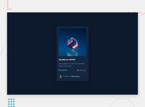
Design comparison
SolutionDesign
Community feedback
- @MarcWebDevPosted about 2 months ago
Nice work!
There is not much to criticize. Your solution is really close to the design.
There are only three things I noticed.
- The avatar at the bottom is missing the white border from the design.
- Your spacing is a little too much.
- You should double-check the font sizes and font weights. It looks like some texts are a little too big and some have a wrong font weight.
That's all. I hope my feedback helps and you can improve the three things.
Keep up the great work and have a nice day!
Marked as helpful0
Please log in to post a comment
Log in with GitHubJoin our Discord community
Join thousands of Frontend Mentor community members taking the challenges, sharing resources, helping each other, and chatting about all things front-end!
Join our Discord
