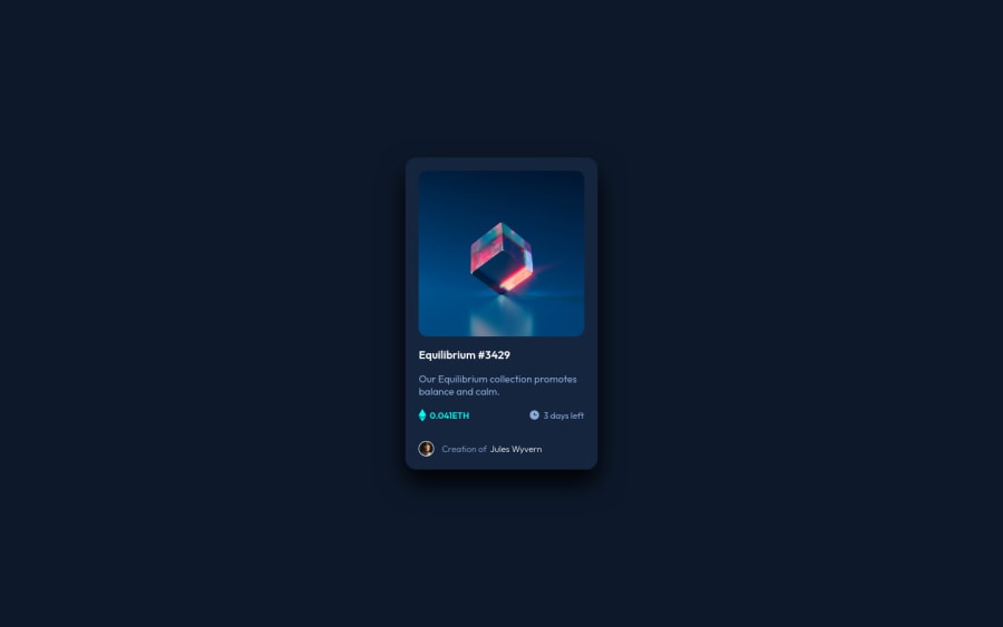
Responsive NFT Preview Card page using HTML and CSS
Design comparison
Solution retrospective
Hello, this is my second challenge on frontend mentor. Please advise if there should be any changes. :)
Community feedback
- @macdeeshPosted about 3 years ago
Hello, first you need to change the HTML in this, as @christianhelms said <ul> and <ol> must only directly contain: <li>, or <template> elements. I would recommend wrapping the Equilibrium or the NFT image with an anchor tag. Every place you see a hover style, you need to include an interactive element, like an anchor tag or button. Also, it's better that you use pseudo-element and background properties to use the SVG icons. That way, you can remove the decorative elements from the HTML structure. Additionally, You need to look up how to write good alt text. You shouldn't be using words like image or hyphenated phrases as if it's code, it is a human-readable description.
Marked as helpful1 - @christianhelmsPosted about 3 years ago
Great job! I like it a lot. It looks really similar to the design file.
Just a few things to note.
- Wrap it in a <main> tag for accessibility
- Always add alt properties to images for SEO and accessibility
- Don't use <p> tags with a <ul> or <ol> try to use <li> instead (list item)
One thing I really liked is that you added the shadows. I didn't even add shadows on mine!
Marked as helpful1
Please log in to post a comment
Log in with GitHubJoin our Discord community
Join thousands of Frontend Mentor community members taking the challenges, sharing resources, helping each other, and chatting about all things front-end!
Join our Discord
