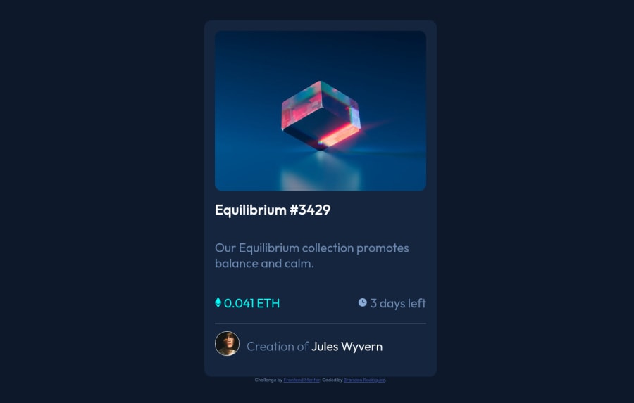
Responsive NFT Preview Card component with flexbox
Design comparison
Solution retrospective
I am new to this so any feedback is welcome. I'm not sure where I need to improve.
Community feedback
- @red-jpoPosted over 1 year ago
Congratulations on completing the solution! I really liked your clever use of Java for the overlay, and I definitely took some notes for future reference. Now, regarding your request for feedback:
Your code has a few responsiveness issues that could benefit from some adjustments. For instance, setting the height and width of the html element to 100% is generally not recommended because it can cause unintended layout issues. It's better to set the height and width of the body element and let the html element expand as necessary to accommodate content. This approach is more flexible and ensures that the layout is not affected by the height of the viewport.
Using percentage for the width of a container can also cause sizing problems across different devices, so it's better to use rem instead for the width of a container to ensure that its size remains constant across devices. Additionally, the width of the card seems to be changing size, which can affect the overall layout of the page. To address this, it might be helpful to set a specific width for the card instead of using a percentage. I ended up going with 21.9rem after some trial and error when I was solving this challenge.
To improve the layout of the attribution class in this type of project, I suggest enclosing all the body code within a main tag and using a footer for the attribution. By setting the main tag height to 95vh and the footer to 5vh, the attribution section will automatically be placed at the bottom without any extra effort. It's important to note that the main and footer elements should have the same width to align properly.
I also noticed that the items in the .nft-info and .creator classes aren't aligned. To fix this, you can use align-items: center; within the contents of these classes. This may cause some margin-related issues, but those can be easily solved by adjusting the margin of the icons.
Finally, while media queries can be useful for making a website responsive, in this project they aren't necessary and can make your code more complicated than it needs to be. I'm also guilty of trying to incorporate new techniques to my code, but it's better to try to step back and check if they aren't causing more harm than good. By making the adjustments above you would be able to delete the queries entirely.
If you'd like to see the adjustments I suggested in action, feel free to check out my code for this project.
Overall, nice challenge and I hope I was able to offer some helpful feedback.
Marked as helpful1@MizunenPosted over 1 year ago@red-jpo should i set the width and height of the body element using rem or vw / vh?Thank you for the feedback too I'm gonna start using rem to size instead of percentages.
0@red-jpoPosted over 1 year ago@Mizunen vw / vh is prefered as it adjusts to the viewport size. However, if you followed my suggestion and added a main tag to the code, you should set the height and width properties in the main element instead. Like this:
body {
  font-size: 18px;
  font-family: "Outfit", sans-serif;
  background-color: hsl(217, 54%, 11%);
  color: hsl(215, 51%, 70%, 0.75);
}

main {
  height: 95vh;
  width: 100vw;
  display: flex;
  align-items: center;
  justify-content: center;
}
Marked as helpful1
Please log in to post a comment
Log in with GitHubJoin our Discord community
Join thousands of Frontend Mentor community members taking the challenges, sharing resources, helping each other, and chatting about all things front-end!
Join our Discord
