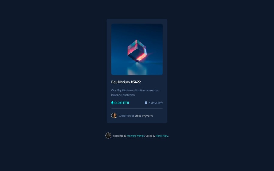
Responsive NFT preview card component using HTML & CSS
Design comparison
Solution retrospective
- Found difficult to make the image hover effect
- Unsure about the measurement of padding and margin size Please give me any suggestion for my code. It will be very helpful to me
My LinkedIn
Community feedback
- @brunomoletaPosted over 1 year ago
Hello Manik,
About the HTML:
- We're better off putting the
attributionpart of the code wrapped in a<footer>and the top part inside<main>.
So it would be:
<main> // code related to the card </main> <footer> //coded by Manik Maity </footer>- Beyond that, it's a good choice to have one
<h1>per page describing the content of the page. To do so on this particular layout would be necessary to hide it:
<h1 class="sr-only"> NFT Equilibrium Card </h1>Hiding this content on the browser, making it available only for screen-readers with the following CSS:
.sr-only{ position: absolute; width: 1px; height: 1px; padding: 0; margin: -1px; overflow: hidden; clip: rect(0, 0, 0, 0); white-space: nowrap; border-width: 0; }- Then, the Equilibrium word gets
the following number with
hwhich is<h2>going like:
<h2 class="card-title"> Equilibrium #3429 </h2>-
Also, it seems you did not close the
<div class="IMG-container">at line 19.It looks like it messed up nothing visually but it's something that may improve. -
And as the Equilibrium Image is important, it's a good decision to put a descriptive
alton it. According to Jad Joubran:
Accessibility benefits
When a user browses a web page using a screen reader and encounters an image element, the screen reader will read the text provided in the alt attribute. Thus, it is necessary to have correct and suitable alternative text for the images we include on our website.
SEO Benefits
Similarly, other machines, such as Search Engines, do not necessarily understand images (nowadays, they do, but not as accurately as humans). So, they use the text provided in the alt attribute to understand the image better.
Ps: the Ethereum and Clock SVGs don't need an
altas they are decorative.- Besides these observations, good job separating the card information from the author with
<hr>. I rarely see people using this tag.
About the CSS:
An option to align your
<div class="price-sec">on line 31 is to set the.priceand.timetowidth:100%and the.timetodisplay: flex; justify-content: flex-end;Resulting in:
.price,
.time{
width: 100%
}
.time {
display: flex;
justify-content: flex-end;
}
I also suggest you take a look at my solution to this challenge because one can learn a lot by reading other people's solutions to the same problem.
If you believe this feedback helped you, please mark it as helpful, as this helps me out.
Keep the hustle, Manik :)
Best regards from Brazil 🇧🇷
1 - We're better off putting the
Please log in to post a comment
Log in with GitHubJoin our Discord community
Join thousands of Frontend Mentor community members taking the challenges, sharing resources, helping each other, and chatting about all things front-end!
Join our Discord
