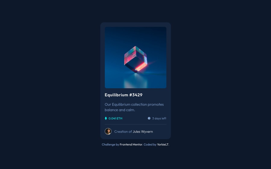
Responsive NFT Preview Card Component using CSS Grid/Flex
Design comparison
Solution retrospective
This project was very fun albeit the hover on the NFT image nearly drove me insane. I have mixed feelings towards my approach on this one so some feedback would be greatly appreciated.
I have 2 questions:
1: I ended up resorting to placing the view icon in a separate div in my card__img element and then positioning the eye icon with relative and absolute respectively, I tend not to like resorting to using positioning as I prefer Flex or Grid. Was my method reasonable or could I have done it better? I had tried different methods first but none seemed to work.
2: I had problems with making this desktop responsive, I noticed how the text (3 days left) and the text with the author's name ended up meeting together and I could not replicate it perfectly, my article container seemed to want to expand it's child elements past 375px and so I found it difficult to make it as 1:1 as I wanted. Could I have done this differently?
Overall feedback and/or suggestions of code changes would be greatly appreciated for me to take into my next projects. :)
Community feedback
Please log in to post a comment
Log in with GitHubJoin our Discord community
Join thousands of Frontend Mentor community members taking the challenges, sharing resources, helping each other, and chatting about all things front-end!
Join our Discord
