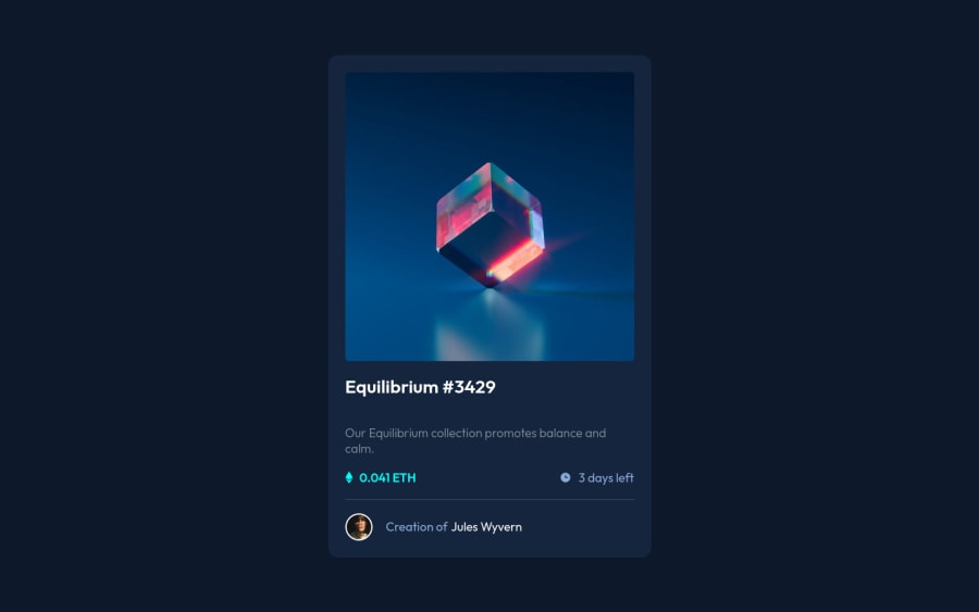
Design comparison
SolutionDesign
Solution retrospective
Community feedback
- @frank-itachiPosted almost 2 years ago
Hello there 👋. You did a good job!
I have some suggestions about your code that might interest you.
CSS 🎨:
- Avoid using absolute length units px, especially for font-size and width properties, because they are not relative to anything else so that means they will always be the same size. Instead, you can use relative lengths like em or rem. The benefit of that last one is element which has that unit will scale relatively to everything else within the page, e.g., the parent container. You can dig up about it here
I hope you find it useful! 😁😁 Above all, the solution you submitted is great👌!
Happy
<coding />😎!Marked as helpful1@i7ectorPosted almost 2 years ago@frank-itachi thanks, I have been trying to avoid using absolute length units but I've been finding it so jarring when trying to make the design responsive. I've always try to build it mobile first and then only make it fit on the bigger screens. I appreciate the feedback and I'll look into it.
0
Please log in to post a comment
Log in with GitHubJoin our Discord community
Join thousands of Frontend Mentor community members taking the challenges, sharing resources, helping each other, and chatting about all things front-end!
Join our Discord
