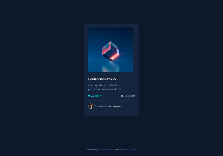
Design comparison
SolutionDesign
Solution retrospective
Hi there! After finishing this project, I realized that I had made it more difficult for myself. I made a mistake with Figma's design details. Then, in the HTML, I added redundant divs. Another difficult moment for me was trying to fix the card. I mean, when I checked it in Dev tools, the container was in the moving state for the mobile view. I'd appreciate any feedback to help me improve my code. Thank you very much!
Community feedback
Please log in to post a comment
Log in with GitHubJoin our Discord community
Join thousands of Frontend Mentor community members taking the challenges, sharing resources, helping each other, and chatting about all things front-end!
Join our Discord
