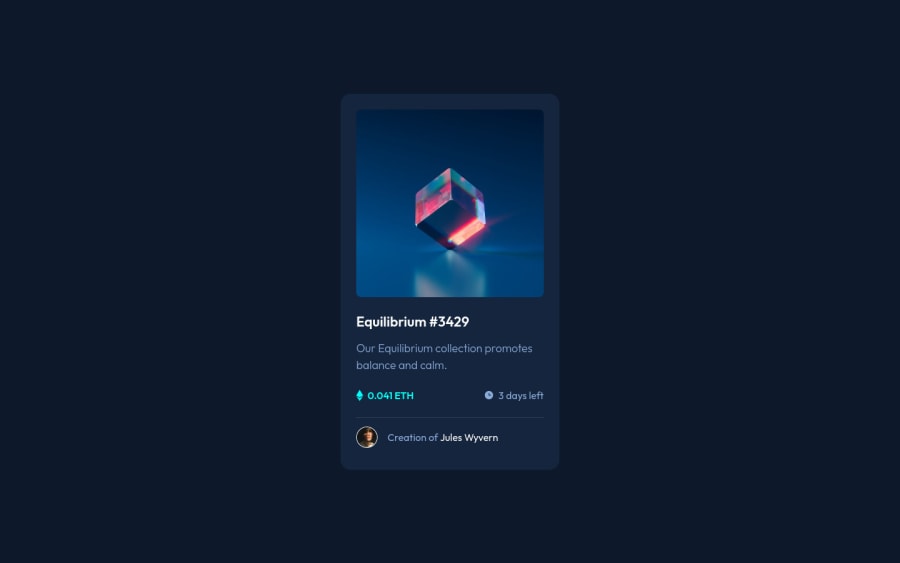
Responsive NFT Preview Card, Component HTML5 & CSS3
Design comparison
Solution retrospective
Any feedback that's will improve my code <3.
Community feedback
- @PhoenixDev22Posted almost 3 years ago
Hello @AbdulrahmanFE,
I have some suggestions regarding your solution:
To tackle the accessibility issues:
- you can add a
<h1>
withclass="sr-only"
(Hidden visually, but present for assistive tech).
.sr-only { border: 0 !important; clip: rect(1px, 1px, 1px, 1px) !important; -webkit-clip-path: inset(50%) !important; clip-path: inset(50%) !important; height: 1px !important; margin: -1px !important; overflow: hidden !important; padding: 0 !important; position: absolute !important; width: 1px !important; white-space: nowrap !important; }
-
Anything with a hover style in a design means it's interactive. you need to add an interactive element around the imageand
Jules Wyvern
. -
<img src="images/image-equilibrium.jpg" alt="cube">
the alt text should be NFT . -
It should be
<h2> <a href="#">Equilibrium3429#</a></h2>
-
<p>Creation of <a href="#">Jules Wyvern</a></p>
. -
<svg> 's
do not add important information to a document should be considered decorative. You can use aria-hidden="true" to hide the SVG from screen readers. focusable="false" is also used to ensure Internet Explorer won’t allow the Tab key to navigate into the SVG. -
the link should be wrapping the original image and either have
Sr-only
text, anaria-label
oralt
text that says where that link takes you. -
never use
span
for meaningful content. -
You can use an unordered list
<ul>
class="info"<li>
, there would be<svg >
and<p>
.
I recommend :
body { /* height: 100vh; */ /* width: 100vw; */ /* position: relative; */ background-color: hsl(217, 54%, 11%); font-family: 'Outfit', sans-serif; display: flex; align-items: center; justify-content: center; min-height: 100vh;/*- min-height: 100vh;/*using vh (viewport height) units to allow the body to set a minimum height value based upon the full height of the viewport. */ width: 100%; } .container { /* position: absolute; */ /* left: 50%; */ /* top: 50%; */ /* transform: translate(-50%, -50%); */ background-color: hsl(216, 50%, 16%); max-width: 350px;/*- an explicit width is not a good way . Remove the width from the card component and change it to ``max width`` instead. That will let it shrink a little when it needs to*/ padding: 25px; border-radius: 16px; }
-
Never use
px
for font-size. -
You should use
em
andrem
units .Bothem
andrem
are flexible, Usingpx
won't allow the user to control the font size based on their needs. -
A general point - try to put classes directly on anything you want to style. Then you won't need as many nested css selectors.
Hopefully this feedback helps.
Marked as helpful1@AbdulrahmanFEPosted almost 3 years agoHey @PhoenixDev22 ! Thanks for your feedback, I applied your suggestion to my code.
1 - you can add a
Please log in to post a comment
Log in with GitHubJoin our Discord community
Join thousands of Frontend Mentor community members taking the challenges, sharing resources, helping each other, and chatting about all things front-end!
Join our Discord