Design comparison
Solution retrospective
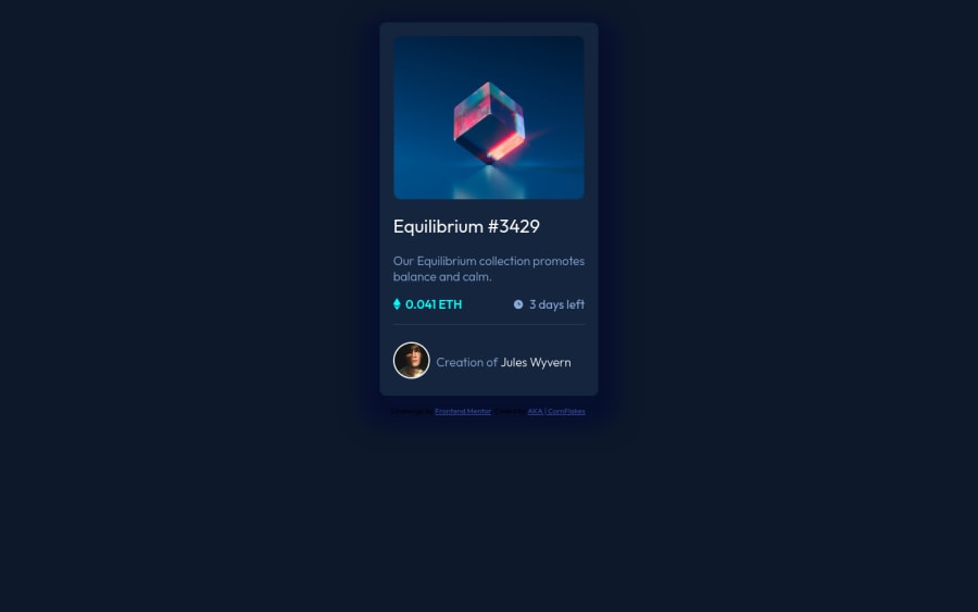
Another day, another challenge done. The most difficult part was trying to create the overlay effect. Had to research a ton before finally getting the result.
Any feedback is appreciated for best practice or an easier way to create the overlay effect. Thanks!!
Community feedback
- @PhoenixDev22Posted over 2 years ago
Hello Cornflakes ,
You're welcome and Glad to help. I really appreciate your compliment.
There are so many ways to do the hover effect on the image, The one I would use is pseudo elements
::before, ::after
. You can use pseudo-elements to change the teal background color to hsla. Then the opacity can be changed from 0 to 1 on the pseudo element on the hover. Also using pseudo elements makes your HTML more cleaner as there's no need for an extra clutter in the HTML . You can have a look at my solution here.Also, I really recommend to check @vanzasetia’s solution as he always provide very detailed READMe.md files explaining the process of building the project, and I'm sure It will be such great help.
Hopefully this feedback makes it clearer.
Marked as helpful2 - @pradeeps4iniPosted over 2 years ago
Hi, @CornflakesPlus. You did a great job converting the design to code.
I would like to offer a different perspective on making the overlay for the image. You can use pseudo elements to achieve it. I wrote this little demo to show how it can be achieved. You can read and modify it. https://codepen.io/pradeeps4ini/pen/yLKbRqB
When i resize the window below 350px, the image size stays same while the card width shrink. You can fix it, by setting the property "max-width: 100%" on the image.
Have fun doing more projects.:)
Marked as helpful2@CornflakesPlusPosted over 2 years agoThanks for the feedback Pradeep! I did not notice that my img tag was messed up on small screens, your snippet worked like a charm. I've used your overlay effect method and learned a lot of new things but can't seem to make transition property work on this method. Is there a workaround for it?
0@pradeeps4iniPosted over 2 years ago@CornflakesPlus I added a transition to the demo. Did you mean something like that?
Marked as helpful1@CornflakesPlusPosted over 2 years ago@pradeeps4ini That's exactly what I meant. Perfectly done! I don't know why it did not work before. I did add the
transition
property but it wasn't working, hmmm strange. Anyways, thanks a ton, Pradeep!0 - @DavidMorgadePosted over 2 years ago
Hello man congrats finishing the challenge!
The only important issue that I find on your project is the centering of the component, this can be sometimes tricky and can be quite easy to fix to get your component on the center of the screens with just a few lines of code, you can fix this giving your
body
aheight: 100vh
and then using flex in the body like this:display: flex; justify-content: center; align-items: center;
With this code you can remove the
margin
of yourmain
and the component will be centered on the screen, apply this for your future frontendmentor projects (there are a lot similar to this one) that requires to be centered on the screen!Hope my feedback helps you, good work!
Marked as helpful2@CornflakesPlusPosted over 2 years agoHey David, thanks for the feedback. I've implemented the changes and it worked beautifully. I had trouble positioning the footer after the main card, so used absolute positioning for it. I hope that's not a bad practice. Cheers.
1 - @PhoenixDev22Posted over 2 years ago
Hello Cornflakes,
Congratulation on completing this challenge.
Excellent work! I see you have received some incredible feedback. I have few suggestions regarding your solution, if you don't mind:
HTML
you should use
<footer>
for the attribution and it should lives in the <body>. HTML5 landmark elements are used to improve navigation experience on your site for users of assistive technology.`-
Since there's a :hover state on the image and means it's interactive, So there should be an interactive element around it. When you create a component that could be interacted with a user , always remember to include interactive elements like(button, textarea,input, ..) for this imagine what would happen when you click on the image, there are two possible ways:
1: If clicking the image would show a popup where the user can see the full NFT, here you use<button>
. 2:If clicking the image would navigate the user to another page to see the NFT, here you can use<a>
. For the same reason , you can use<a>
to wrapEquilibrium #3429
andJules Wyvern
. -
The link wrapping the equilibrium image should either have
Sr-only
text, anaria-label
oralt
text that says where that link takes you. -
For any decorative images, each img tag should have empty
alt=""
and addaria-hidden="true"
attributes to make all web assistive technologies such as screen reader ignore those images in(icon-view, icon-ethereum, icon-clock
).
4.Images must have alternate text. look up a bit more about how and when to write alt text on images. Learn the differences with decorative/meaningless images vs important content
If you wish to draw a horizontal line, you should do so using appropriate CSS. You may remove the
<hr>
, you can useborder-top:
to the avatar's part.To use more semantic tags , you may use
<figure>
and<figcaption>
for the avatar's part.The avatar's alt needed on the image as it's an informative image. You can use the creator's name
Jules Wyvern
. Read more how to write an alt textCSS:
-
Consider using rem for font size. If your web content font sizes are set in absolute units, such as pixels, the user will not be able to re-size the text or control the font size based on their needs. Relative units “stretch” according to the screen size and/or user’s preferred font size, and work on a large range of devices.
-
There are so many ways to add the hover effect on the image, The one I would use, using pseudo-elements to change the teal bg color to a hsla. Then opacity can be changed from 0 to 1 on the pseudo element on hover.The icon view image doesn't really need to be in the HTML
-
Remember a css reset on every project. That will do things like set the images to display block and make all browsers display elements the same.
Overall , Your solution is good. hopefully this feedback helps.
Marked as helpful1@CornflakesPlusPosted over 2 years agoWow! I greatly appreciate the time you spent on such outstanding feedback. Did not expect such detailed feedback. THANK YOU FOR THAT! I absolutely don't mind new/better suggestions or critiques.
I've implemented most of the HTML you suggested and learned quite a lot about alt elements. Seems like using rems is the way to go but a lot of tutorials out there use pixels for some reason, that's the reason I've used pixels for most font-sizes. Guess they're just being lazy?
"The icon view image doesn't really need to be in the HTML"
Searched alot online for alternate ways, some of them seemed too complex to implement and time-consuming. The one that worked well is this method. If possible could you share a small code snippet to show me a better way for the image overlay effect? That would be awesome!
"Remember a css reset on every project" I'll implement that on all future projects.
Once again, thanks a ton for the valuable feedback. I know it's not easy. Another thing I noticed, you have almost 9000 points. That speaks volumes. ;)
0 -
Please log in to post a comment
Log in with GitHubJoin our Discord community
Join thousands of Frontend Mentor community members taking the challenges, sharing resources, helping each other, and chatting about all things front-end!
Join our Discord