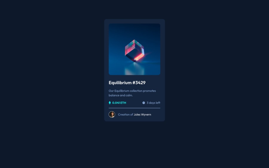
Design comparison
SolutionDesign
Community feedback
- @AdrianoEscarabotePosted almost 2 years ago
Hi Sarosh Farhan, how are you? I really liked the result of your project, but I have some tips that I think you will enjoy:
A good practice to center content is using
gridorflex-box, avoid using margin or padding to make placements, use only in the latter case! we can do it like this:Flex-box:
body {
    display: flex;
    align-items: center;
    justify-content: center;
    flex-direction: column;
    min height: 100vh;
}
GRID
body {
    display: grid;
    min height: 100vh;
    place-content: center;
}
The rest is great!
I hope it helps... 👍
Marked as helpful1@saroshfarhanPosted almost 2 years ago@AdrianoEscarabote thank you so much, I was trying to do so but somehow with tailwind CSS it wasn't working so I added padding and margin but will keep this in mind next time, thank you for taking out time and reviewing my code, much appreciated!!
1
Please log in to post a comment
Log in with GitHubJoin our Discord community
Join thousands of Frontend Mentor community members taking the challenges, sharing resources, helping each other, and chatting about all things front-end!
Join our Discord
