Not Found
Not Found
Not Found
Not Found
Not Found
Not Found
Not Found
Not Found
Not Found
Not Found
Not Found
Not Found
Not Found
Not Found
Not Found
Not Found
Not Found
Not Found
Not Found
Not Found

Submitted

Responsive NFT Preview Card Component

@suryathink

Desktop design screenshot for the NFT preview card component coding challenge

This is a solution for...

  • HTML
  • CSS
1newbie
View challenge

Design comparison


SolutionDesign

Solution retrospective


I am facing 1 difficulty in this Project.

I need Help on that from the frontend Mentor Community.

Problem

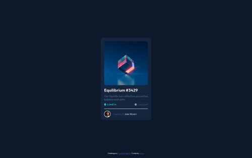
The Equilibrium Image is present inside the div. Here is the code of that

 <div class="equilibrium-image-div">
        <img src="images/image-equilibrium.jpg" alt="Equilibrium" />
      </div>

I have added styles on the div

    background-color: hsl(178, 100%, 50%) !important;
    border-radius: 10px;
    background-image: url(/images/icon-view.svg);
    background-repeat: no-repeat;
    background-position: center center;
    color: white;
  }

But the problem is whenever I am hovering on the equilibrium image I am getting background-color of background-color: hsl(178, 100%, 50%) !important;

in some extra portions below the bottom of that image.

How to avoid that?

Here is the Attached image https://www.awesomescreenshot.com/image/43779882?key=2aaed64d11a1f0952b4f8afcf9584bdc

Community feedback

@atmahana

Posted

Hi there. I noticed that the container does not have the same height as the image hence why the extra portion you see when hovering on the image. The workaround I would try to fix this is as following:

.container {
    max-width: 250px;
    aspect-ratio: 1 / 1;
    overflow: hidden;
}

.child {
    width: 100%
}
  • max-width: 250px; : This property sets the maximum width of the .container element to 250 pixels. This means that the container will not exceed this width, even if the content inside it is wider.

  • aspect-ratio: 1 / 1; : This CSS property sets the aspect ratio of the .container. An aspect ratio of 1/1 means that the container will have a square aspect ratio. This is achieved by making the height of the container equal to its width, which maintains a square shape.

  • overflow: hidden; : This property hides any content that overflows the boundaries of the container. In this case, since the container is set to a fixed width and a square aspect ratio, if the content inside it is larger, it will be clipped and not visible.

  • width: 100%; : This property sets the width of the .child element to 100% of its parent container's width. In this case, since the .container has a maximum width of 250 pixels, the child element will take up the full width of the container.

I hope this clears some things. Cheers mate.

Marked as helpful

2

Please log in to post a comment

Log in with GitHub
Discord logo

Join our Discord community

Join thousands of Frontend Mentor community members taking the challenges, sharing resources, helping each other, and chatting about all things front-end!

Join our Discord