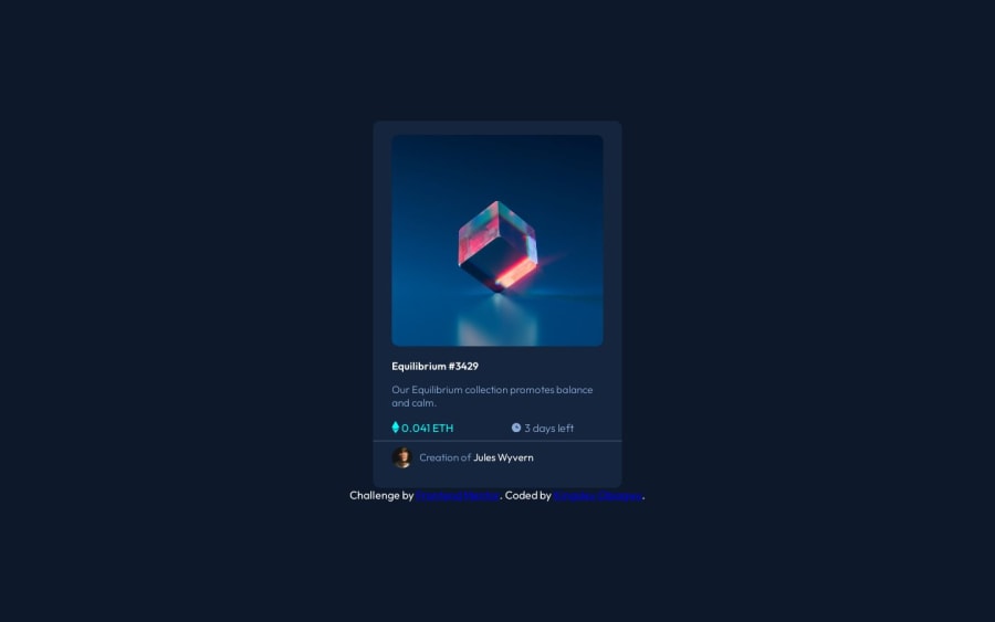
Design comparison
SolutionDesign
Solution retrospective
Any Suggestion from anyone is welcomed
Community feedback
- @danielmrz-devPosted 12 months ago
Hello, @Kingsleigh-Obi!
Your project looks good!
The only thing that's missing is the
hover effecton the image, the title and the person's name:About the image, it's a bit tricky, but here's how you can do it:
HTML
<img src="images/image-equilibrium.jpg" alt="Equilibrium" class="pic">
    <div class="icon">
      <img src="images/icon-view.svg" alt="icon-view" class="icon-view">
    </div>
CSS
         .pic {
            width: 300px;
            background: url('images/icon-view.svg') center center no-repeat;
            background-color: $Cyan-hover;
            background-size: cover;
            margin: auto;
            border-radius: 10px;
        }
        .icon {
            display: grid;
            justify-content: center;
            align-items: center;
            position: absolute;
            opacity: 0;
            background-color: $Cyan-hover;
            width: 300px;
            height: 300px;
            border-radius: 10px;
        }
            icon:hover {
                opacity: .5;
                cursor: pointer;
            }
Don't forget to change the class names to match your project's.
Other than that, my friend, great job!
Marked as helpful1@Kingsleigh-ObiPosted 11 months agoThank you so much@danielmrz-dev i really appreciate it
1
Please log in to post a comment
Log in with GitHubJoin our Discord community
Join thousands of Frontend Mentor community members taking the challenges, sharing resources, helping each other, and chatting about all things front-end!
Join our Discord
