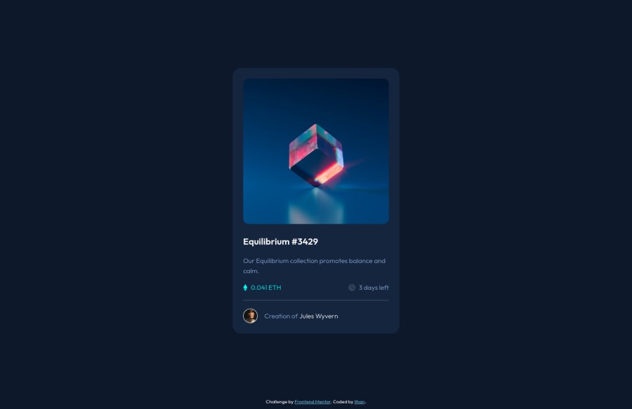
Design comparison
Community feedback
- @PhoenixDev22Posted almost 3 years ago
Hello @ilhanhakan-koc,
I have some suggestions regarding your solution:
-
To tackle the accessibility issues, You can add a
<h1>withclass="sr-only"(Hidden visually, but present for assistive tech). -
You can use a landmark
footerfor the attribution . HTML5 landmark elements are used to improve navigation . -
Anything with a hover style in design means it's interactive. you need to add an interactive element
<a>around the image,Equilibrium #3429 and Jules Wyvern. add hover effect on them . -
the
fa-eyedoesn't really need to be in the html, you could do it with css. If you want it to stay in html it needs to be aria-hidden or role presentation with empty alt. -
I would use pseudo-elements to change the teal bg color to a hsla. Then opacity can be changed from 0 to 1 on the pseudo element on hover as there is no reason to have the extra clutter in the html.
-
The avatar's alt shouldn't be
An avatar of the userit's meaningless , you can useJules Wyvernfor it. -
No need for
<div class="main__line"></div>, you can simply useborder-topto the avatar's partclass="main__footer". -
So you can use
<ul>to wrap` class="main__information">and in each<li>there would be<i>and <p>. -
the link should be wrapping the main image and either have
Sr-onlytext, anaria-labeloralttext that says where that link takes you. -
width: 380px;an explicit width is not a good way . Remove the width from the main component and change it tomax widthinstead. That will let it shrink a little when it needs to.
General point : Nesting css selectors not a good thing . Really important to keep css specificity as low/flat as possible. The best way to do that is single class selectors.
Overall, your solution is good, Hopefully this feedback helps.
Marked as helpful0@ilhanhakan-kocPosted almost 3 years ago@PhoenixDev22
Wow thank you so much for the detailed information. Didn't noticed that I missed so many points. I've edited my project and tried to add all the points listed above in my project.
0 -
- @RioCantrePosted almost 3 years ago
Hello there! Good job in completing this project. Regarding your solution, I would like you to notice the following…
- This part of the line
<div class="attribution">could be wrap withfootertag. Alternative way is to place it inside themaintag - In this line, it could be wrap with
sectiontag...
 <h2>Equilibrium #3429</h2>
      <p>Our Equilibrium collection promotes balance and calm.</p>
Into:
<section>
      <h2>Equilibrium #3429</h2>
      <p>Our Equilibrium collection promotes balance and calm.</p>
</section>
Other than that..
- You utilized the semantic well, specially wrapping the whole content with
maintag. - The HTML structures looks good.
- The code looks neat and readable.
- The CSS file is well organized and proper usage of sizing elements
- The design itself it well implement and properly used the given details of the design
Above all, the project is done well. Keep up the good work! Cheers!
Marked as helpful0@ilhanhakan-kocPosted almost 3 years ago@RioCantre
Thank you so much for your feedback. I have added your tips to my project.
0 - This part of the line
Please log in to post a comment
Log in with GitHubJoin our Discord community
Join thousands of Frontend Mentor community members taking the challenges, sharing resources, helping each other, and chatting about all things front-end!
Join our Discord
