

Design comparison
SolutionDesign

Solution retrospective
I would love to hear your feedback :)
Please log in to post a comment
Log in with GitHubCommunity feedback
- @CyrusKabir
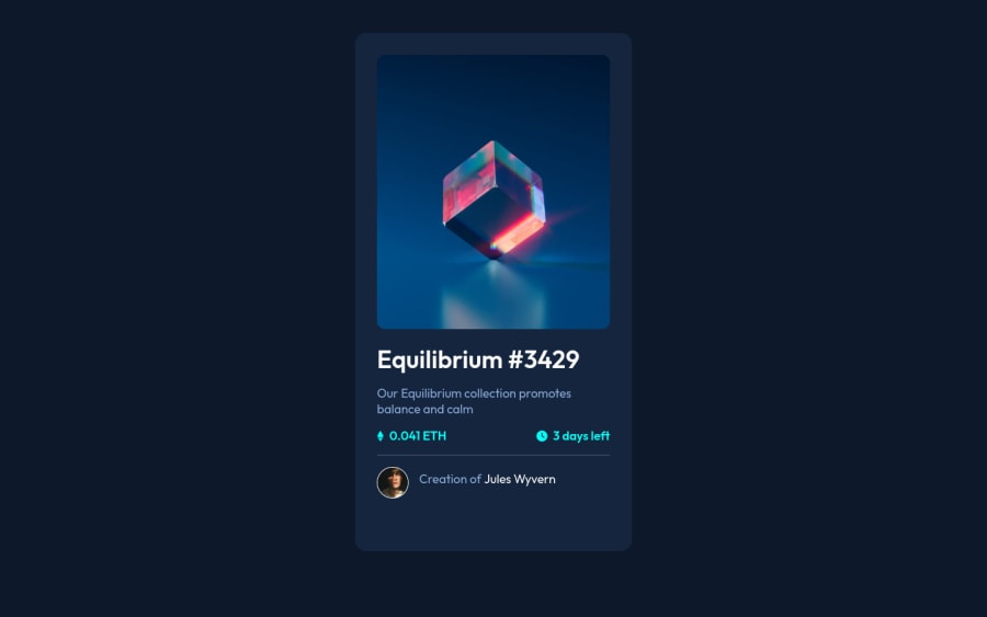
hello my dear friend ♥ you did good on this challenge but you need get close to main design and here some tips :
- in main design card bottom padding it's less than in your card
- also the h1 default font-size is to much for this card title
- adding some
line-heightto body (for that text content under title) - your img have impact on your card dimension (because of that absolute width and height you add) if you remove it you can see there is not even needed to be there
- and it's a good thing to use a file structure when you use sass/scss it's make your code clean, readable, reusable, maintainable , and much more benefits also you can check this links for sass file structure 2 way to structure your sass, structuring your sass, simple sass structure
Marked as helpful - @Akhlak-Hossain-Jim
You have done great work so far.
Try implementing these:
- add
altattribute in images and don't keep it empty. - go
h1toh6serially, meaning use first heading tag ash1then if you need to go down, do not go toh3orh4go toh2first then following and repeath1or any one of those but keep it in sequence. - try using sass variable.
Happy coding :)
Marked as helpful - add


Join our Discord community
Join thousands of Frontend Mentor community members taking the challenges, sharing resources, helping each other, and chatting about all things front-end!
Join our Discord