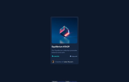
Submitted over 1 year agoA solution to the NFT preview card component challenge
Responsive NFT Card using HTML and CSS
accessibility, semantic-ui
@KrishnaPoddar1

Solution retrospective
What specific areas of your project would you like help with?
the clock and the text are not getting placed together on the same line.
Any other advice or suggestion will be helpful
Code
Loading...
Please log in to post a comment
Log in with GitHubCommunity feedback
No feedback yet. Be the first to give feedback on KrishnaPoddar1's solution.
Join our Discord community
Join thousands of Frontend Mentor community members taking the challenges, sharing resources, helping each other, and chatting about all things front-end!
Join our Discord