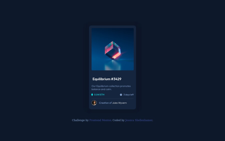
Design comparison
Solution retrospective
Some of the challenges I faced are:
-
getting the image overlay to stop overflowing at the smaller sizes
-
keeping ".view" that's on the image overlay at opacity:1 while the rest of the overlay becomes more transparent. I tried separating ".view" from the overlay and using absolute positioning and z-index to position it on top of the image overlay, but instead it took a cyan tint, and it didn't fix the opacity issue.
-
Is there a better way to create the box shadow layers? I ended up changing the value of the color used for the shadow slightly and it's not quite the same as the expected results in the screenshots provided for the challenge.
Any feedback would be greatly appreciated,
Thank You
Updates*
- Opacity issue on hover has been corrected.
Community feedback
- @zeerobitPosted over 3 years ago
regarding your challenge with keeping .view at opacity 1, you actually don't need to add any opacity to it all. You can add the opacity directly to the cyan background-color itself using the rgb format as you know in rgb you can add a fourth value which is the opacity in order to manipulate the transparency of any color; example "background-color: rgb(0, 255, 247, 0.4);" then on your hover class use opacity:1 that way you don't have to worry about lowering the opacity on the background color when you hover since it'll already have its own opacity value set ..
Hope this helps..Happy coding
Marked as helpful1P@perezjprz19Posted over 3 years ago@zeerobit Thank you! That did help. Sometimes I get so caught up on doing things a certain way, I forget there are other ways to achieve the desired result. Hopefully that will come to pass as I gain experience.
0@zeerobitPosted over 3 years ago@perezjprz19 same for me, i'm new to this so i still have a long way to go.
0 - @grace-snowPosted over 3 years ago
I think this solution looks great, well done!
Only a few small improvements to suggest
- if the image has a hover style that needs an anchor tag too. It will need labelling
- you don't write words like "image" in an alt attribute. The element is already an image. If it is meaningful content it needs to be a brief description, like how would you describe it to someone sitting across the room from you who couldn't see it. If its not a meaningful image (like the eye icon) the alt should be left intentionally blank
- it's invalid html to wrap a heading element in an anchor tag. Swap those around so the anchor is inside the heading
- some of the text on this is unreadably small
That's all from me. Well done again
0P@perezjprz19Posted over 3 years ago@grace-snow ooooh! I always get the order confused for the anchor tag and the heading element. I'm pretty sure was told this before through a code validation tool 🤦♀️. I'll take another look and fix the issues you mentioned. Thank you for your feedback!
1
Please log in to post a comment
Log in with GitHubJoin our Discord community
Join thousands of Frontend Mentor community members taking the challenges, sharing resources, helping each other, and chatting about all things front-end!
Join our Discord
