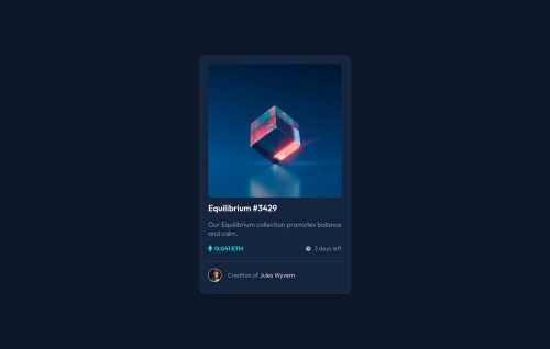
Hi
I'm afraid there are quite a few issues with this. It is overflowing my mobile screen and on landscape view the top of the card is cut off
These problems are caused by
- using height instead of min height 100vh - content can't grow beyond if you limit height like that
- width instead of max width on the card - again that width is wider than my iPhone screen, let it shrink if it needs to
- height on the card - this is not needed at all and should not be used. Let the content inside the card dictate how tall the browser needs to make it
- after these changes, remove the widths and heights from all the main image elements rect etc. Again, these are not needed and will introduce bugs. Instead, all you need is display block and max width 100% on the img tag
Way way more important than any of this though - you are missing interactive elements throughout the html.
Think about when you use the Web - what does a hover indicate? Interactivity. That means it's essential to use an interactive element for every place where there is a hover style in the design (and adding focus-visible styles as well as the hover).
On this I'd use anchor tags for all the places where there is a hover style - around the img, inside the heading, and insise the card footer paragraph
Good luck
Marked as helpful
@Mabchir
Posted
@grace-snow Hi again, your feedback is as usual on point! I am gonna unpack it and research more the "interactive element" piece because I am not familiar with it. Thank you so much, "Marked as most helpful"
@Mabchir
Posted
@grace-snow alrighty, I tried to incorporate everyone's feedback and things look much better, more fluid. some follow up questions if possible:
-
in .rect , when changing the display:block and max-width: 100%, the width doesn't change to fill the whole container. but if I put width: 100% it works. is there a reason why max-width is not working ?
-
not setting a specific height and letting the components fill up the cards makes sense, but is it ok if the size looks different from the design (my screenshot looks longer than the one on the design?
@Mabchir Both absolutely fine ☺️
It's your overlay img you mean you had to make width 100% right? That's because it would need to cover it's parent and it's smaller than the first image
Still a few issues on this but minor
- what does logo as an img description mean? Would you know what that img looked like purely from that description? Probably not
- Content is hitting sides of mobile screen - a little padding on a wrapping element like body or margin on the card should fix
- Anchor tag should go inside the h1 not the other way around
- use meaningful elements like paragraphs, not spans alone (used in price and time left text in this)
- Put class for the author name on the anchor tag - no need for a span. General rule is try not to bloat html if it's not needed
Good job on this though, it's looking really nice now 👍
Marked as helpful