

Design comparison
SolutionDesign

Solution retrospective
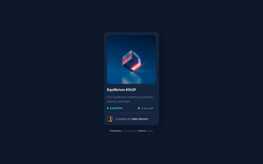
Hi everyone its been long without submitting but am back. so here I managed to do the design of the challenge but I would like to ask for help on: 1.How to do the hover on the image 2.how to design the box-shadows that look exactly the same as the ones in the challenge.
thanks have a productive day.
Community feedback
Please log in to post a comment
Log in with GitHub
Join our Discord community
Join thousands of Frontend Mentor community members taking the challenges, sharing resources, helping each other, and chatting about all things front-end!
Join our Discord