Submitted over 2 years ago
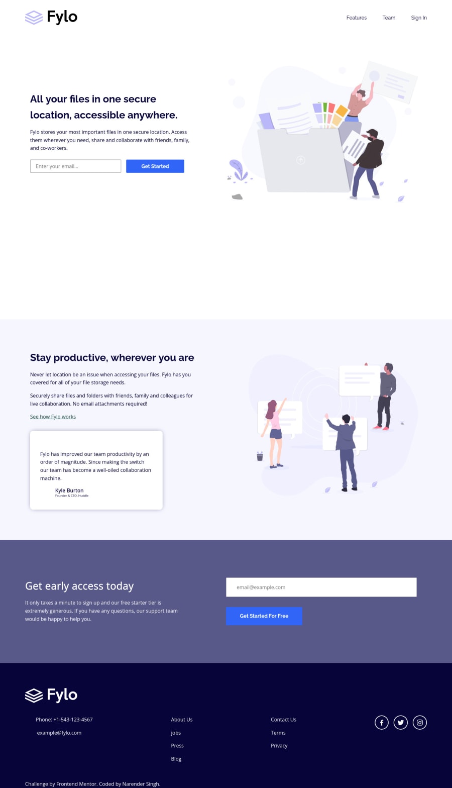
Responsive nextjs webpage
#next#accessibility
@sinredneran
Design comparison
SolutionDesign
Solution retrospective
my first nextjs app and also used boxIcon for icons goals - -use components as much as i needed (i.e on a very large scale as per react suggest) -use components for layouts (for better understanding of manipulating layout with components) -use of tag for easy styling (not recommended and won't try it for every components) , can be helpful for manipulating for small styling (colors, flex-direction etc.) -use lighthouse for better accessibility score
feedbacks are welcome
Community feedback
Please log in to post a comment
Log in with GitHubJoin our Discord community
Join thousands of Frontend Mentor community members taking the challenges, sharing resources, helping each other, and chatting about all things front-end!
Join our Discord
