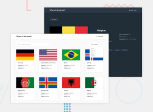
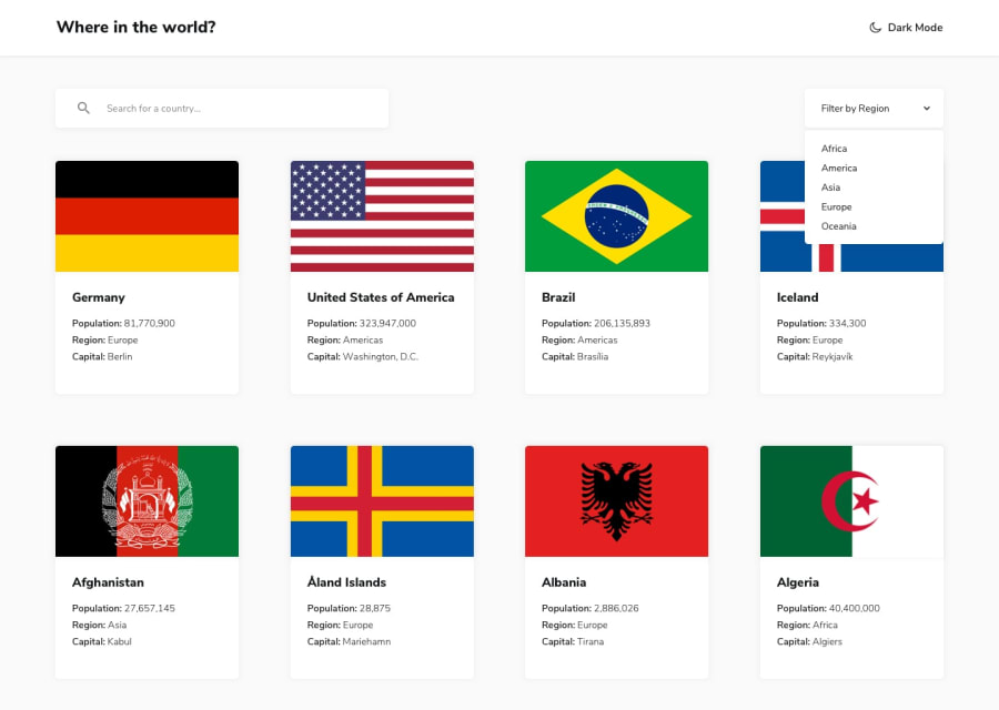
Design comparison
Solution retrospective
This is my first project using NextJS and Tailwindcss, it is also the first time that i build a somewhat complex UI. I ran into problems trying to use SVG to display the countries images on the homepage so I went back to using PNG's instead. Also I could not find a way to properly display border countries names inside each country's information so that's why you see these weird codes. I had a lot of fun completing this challenge and learned a lot throughout the process. If you have any feedback, questions or find a way to improve the site I'll be more than happy to read and answer you!
Community feedback
- @AdrianoEscarabotePosted about 2 years ago
Hi Angel, how are you?
I really liked the result of your project, but I have some tips that I think you will enjoy:
- every Html document must contain the main tag, so we can identify the main content, to fix this, wrap all the content with the main tag. HTML5 landmark elements are used to improve navigation experience on your site for users of assistive technology.
- To improve the accessibility of the project you could have put an h1. Every page must contain a level 1 header, for people who use screen readers, identity what the main title is and follow the sequence h1-h5
- The links must have an aria-label or sr-only text that tells where the link navigates the user. For example: Visit our Facebook. For images, you should set aria-hidden=” true” to be ignored by screen readers and to avoid redundancy and repetition.
The rest is great!
I hope it helps... 👍
Marked as helpful1 - @JaneMorozPosted about 2 years ago
Hey, Angel! Your solution is great ❤️
The only thing I've noticed straight away:
- You need to wrap the main content of the page into the <main> tag. It specifies the main content of a document.
- If you use image or icon inside of the button, I suggest to add aria-label to the <button> tag to improve accessibility. The same goes for links.
Keep it up! And good luck 🍀
1@Pawel-GnatPosted about 2 years ago@JaneMoroz could you give a simple example of that aria-label in reference to button with icon?
0@JaneMorozPosted about 2 years ago@Pawel-Gnat If you have a theme switcher button, you can add
aria-label="change theme"
. Or if it's a twitter link, just addaria-lable="twitter"
. There is more info here.1
Please log in to post a comment
Log in with GitHubJoin our Discord community
Join thousands of Frontend Mentor community members taking the challenges, sharing resources, helping each other, and chatting about all things front-end!
Join our Discord